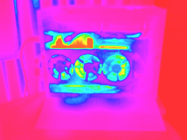
Heatmap / Continuous Colour Scale Gradient Palettes
After previously implementing support for image value remapping in my image-processing infrastructure, I’ve been looking into generating better gradient colour mapping schemes / palettes than the initial hard-coded HSV ramp I used.
The thermal camera I have can bake in one or two pretty nice presets, but as previously discussed, I wanted the freedom and flexibility to “tone-map” them myself afterwards, for more creative freedom.
There are a wide range of colour schemes in various plotting and visualisation libraries and tools, with different schemes being either more- or less-suitable depending on the use-case and the values being represented. In particular, having a lot of different strong colours in a gradient can make the resultant mappings look pretty or striking, but it is then often less easy to perceive the magnitude of values compared to more simpler gradients – but on the other hand does have the advantage that any value differences are mapped to a more obvious change in colours.
More recent/modern colour mapping schemes have aimed to improve aspects such as being perceptually uniform, and being more friendly to those suffering from colourblindness, whilst still producing visually appealing results.
The docs page for Plots in Julia has a nice set of example colour schemes / palettes, so I decided to try copying some of the more interesting colour mappings from those schemes to see how they looked, essentially by just interpolating splines of linear colour values to evaluate the gradients, which for my purposes should be sufficient.
Example gradient strips:
Hue (reversed):
At first glance, this gradient palette that varies the Hue colour looks nice, but the similarities in redness at either end (red and magenta), due to the Hue of HSV being a circular map (or mapped to a cone or cylinder) mean that the colours at the extremities are somewhat difficult to tell apart, especially for those who are affected by colour blindness. It’s also more difficult to interpret a “rainbow” of colours to gauge their magnitude, so in practice this gradient doesn’t seem that suited for many visualisations.
Heat:
This is very effective and simple for both thermal images and density plots / maps, and is essentially a limited, rough approximation of “black-body” temperature emission colour (it stops at white, rather than continuing on to blues).
Inferno:
This is also very effective, and seems to closely match one of the presets my thermal camera can bake into its images.
Jet:
A colourful gradient that has better colour separation at either end than Hue, although still likely suffers from the “too many colours” issue for the use-case of gauging value magnitude compared to more simpler schemes.
Plasma:
A more limited gradient.
Turbo:
Visually quite pleasing, but again, as this was largely designed for visualising disparity and depth maps, it isn’t primarily aimed at being able to easily gauge value magnitude, but is an improvement over Jet.
Viridis:
A very pleasing colour gradient that seems to work well for density plots.
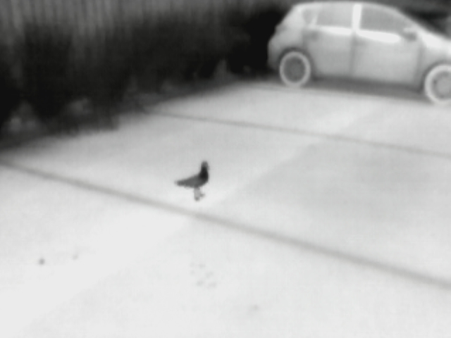
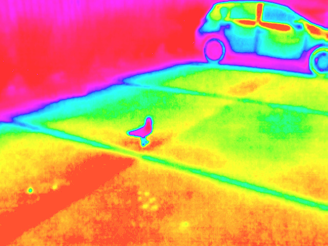
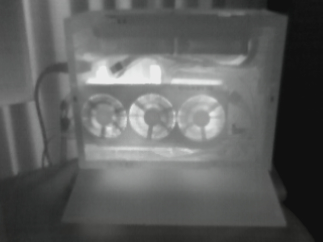
Thermal Image examples:
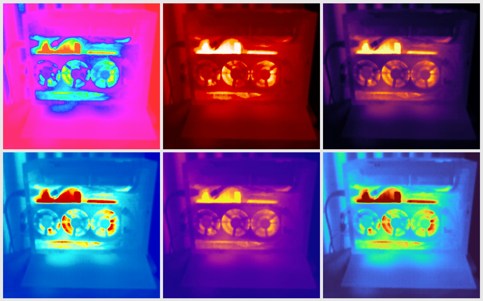 Clockwise from top-left: Hue, Heat, Inferno, Turbo, Plasma, Jet.
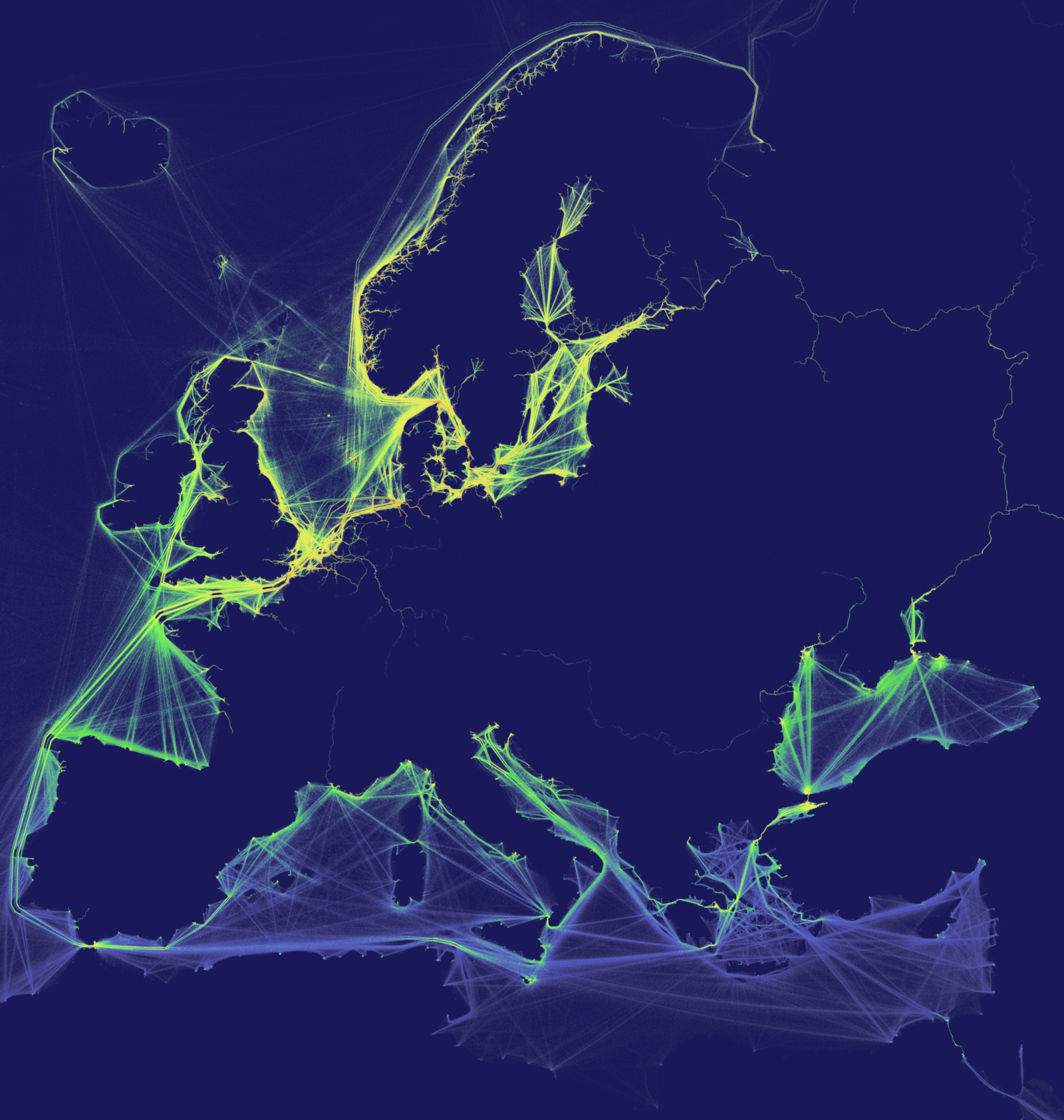
Shipping density map plot examples:
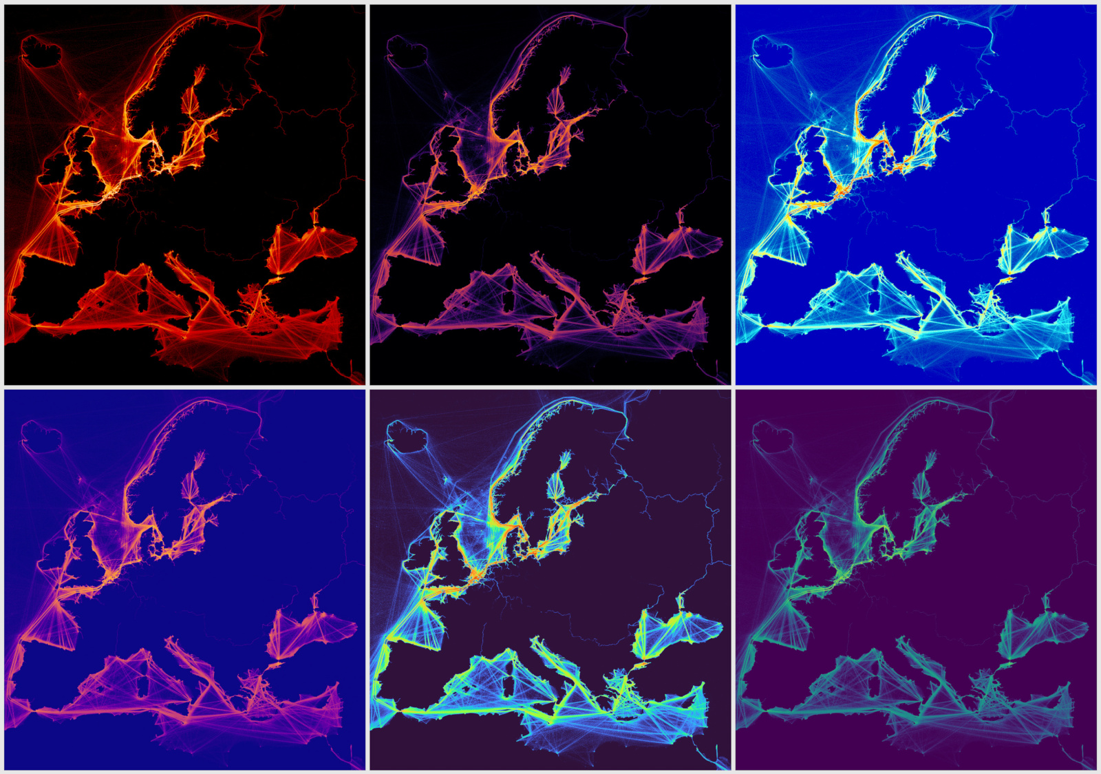 Clockwise from top-left: Heat, Inferno, Jet, Viridis, Turbo, Plasma.
So far, from the colour gradient schemes I’ve played around with, I think Heat and Inferno are my favourite schemes for thermal images, and they seem to additionally work very well for density plots and maps too. Viridis may also become one of my go-to colour gradient schemes for density plots, as that appears to also produce nice results.


