Over the past few years, as well as learning the Rust programming language, I’ve also been attempting to learn more about the JavaScript ecosystem for front-end web development as well, although the seemingly large number of different libraries/frameworks available has made that a somewhat daunting task in terms of starting point. Because of this, I had decided not to just learn generic and popular web frameworks that were the most popular ones at the time of learning, but to explicitly use ones that seemed to match well with particular use-cases I had in mind.
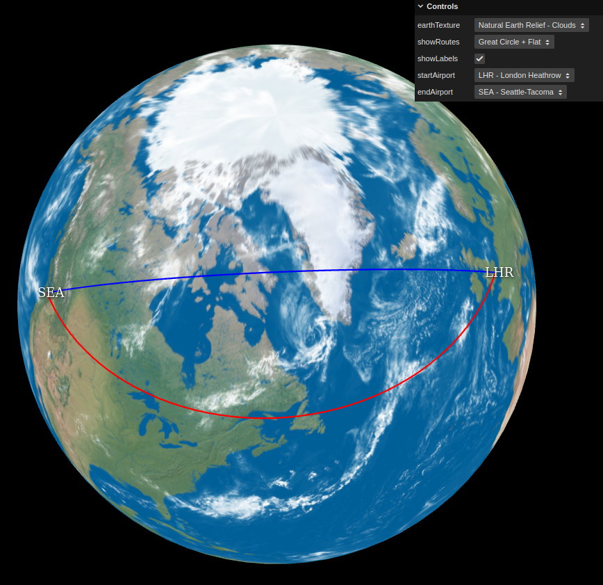
In this case, I’ve been writing a basic web app for visualising Great-Circle Routes (link to app here) between common airports. There are various existing ones on the web in some form or another, but many produce only flat 2D visualisations, and while there are one or two 3D ones showing the routes on a 3D globe, they weren’t exactly to my liking, and regardless, it provided me with an interesting use-case with which to gain some more experience with JavaScript and web-based real-time rendering.
I did at first think about sticking to core vanilla JavaScript and using WebGL directly with no use of additional frameworks/libraries, but given I wanted something working fairly quickly, I decided that using a library would be the more efficient solution, and a quick look at https://threejs.org/ and its capabilities re-enforced that decision.
In the end, it was pretty simple to come up with a basic working example, with a sphere mesh object with a diffuse earth texture on, with an orbit-able camera, with “route” line meshes representing the Great-Circle Route and “flat” 2D route in question being drawn based off spherical coordinates in 3D space from source latitude and longitude coordinates. The Great-Circle Route between two points was calculated by using the Haversine Formula.
The most “complicated” thing in the implementation ended up being the Airport text labels: while it was simple enough to use THREE.CSS2DObject to construct high-quality DOM text items that appear in the correct 2D screen position based off the camera/earth position of where the respective airports are on the sphere, occlusion/visibility handling isn’t done automatically with this setup, as the DOM elements are not actually part of the 3D scene, they’re layered on top. So in order to hide the label text of airports when they’re occluded by the Earth sphere geo (i.e. when they’re around the back of the Earth to the camera), I ended up having to send Raycaster queries to detect the visibility of the position of the airports from the camera, and adjust the visibility of the Airport label CSS2DObject objects based off the result of these queries within the main render loop. This was still quite easy to do however, and seems to work well enough, although doing the raycaster queries within the render loop is probably not the most optimal solution in terms of efficiency, so I might need to look into better ways of handling that.
There’s still room for improvement though: the thickness of the route lines should ideally scale with the zoom level in screen-space, and the fixed colour of the lines means it’s not always easy to see them depending on the Earth texture being used underneath them, so I might have to look into some kind of contrast/blending setup in the future in order to make the route lines easier to see.
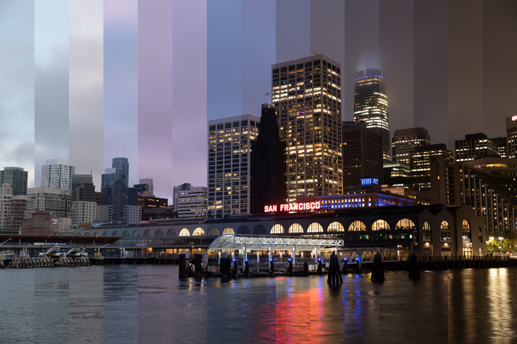
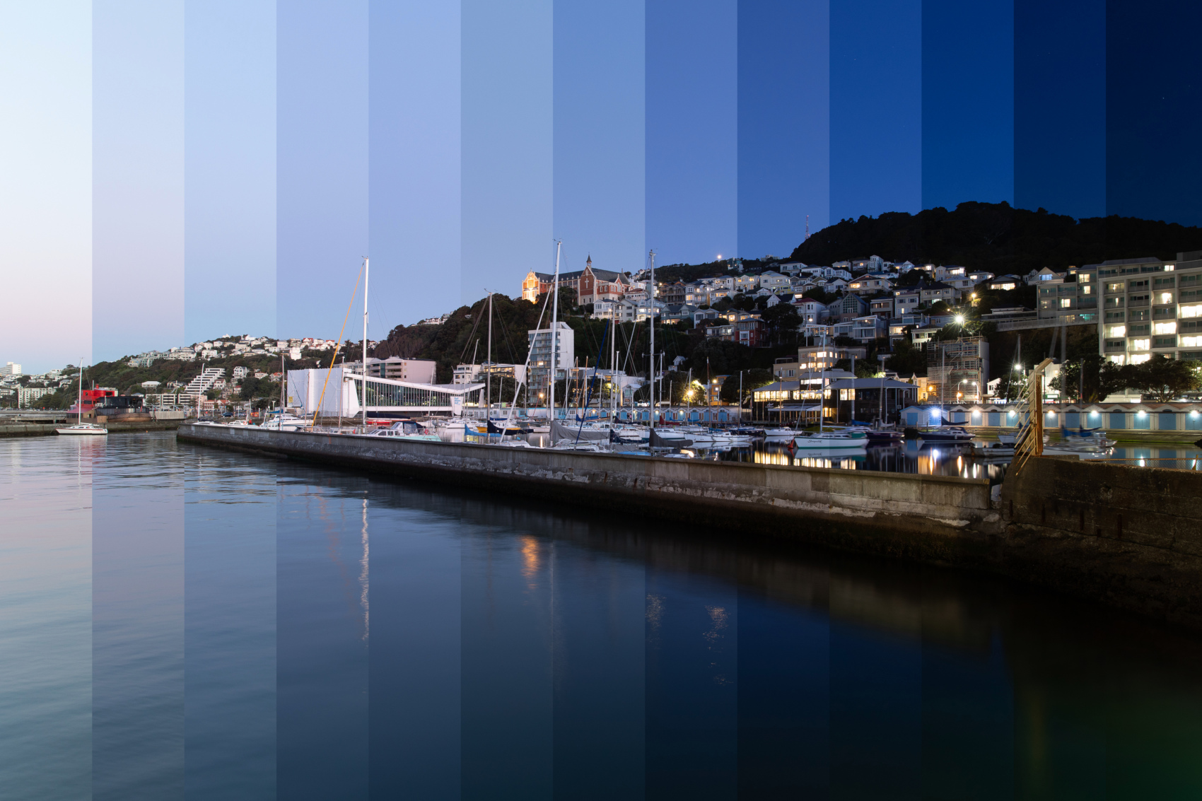
Over the past few months I’ve made some attempts at timelapse photography, mainly motivated by seeing this site/software on High Dynamic Time Range Images which effectively “blends” multiple images taken at different times into one final image.
Rather than use the above software (which is written in Perl), I decided to write my own implementation using my existing image processing infrastructure I have, and have so far come up with a simple implementation that supports linear “equi-width” blending, and in the future I plan to implement more varied interpolations similar to the original software, as from experimentation, Sunrises/Sunsets and the progression from day to night are not often linear in the resultant brightness of captured images.
Scenes with many lights in that progressively turn on within the timelapse duration seem to work very well generally: here are two examples I’m fairly happy with, showing both non-blended and fully-blended examples of each.
San Francisco:
Wellington:
There do though appear to be some types of scenes that don’t always seem to work that well with this technique, in particular ones where the sun is either quite prominent or the sky gradient in the horizontal direction is very noticeable: this can lead to “odd”-looking situations where the image “slices” which show the sky should in theory get darker as you progress through time, but due to the sky colour gradient in the source images, it counteracts this on one edge of each image slice, looking a bit weird (at least to my eyes).
I also tried converting a sunrise timelapse sequence I took several years ago in Australia which had clouds moving very slowly across the sky horizontally in the frame, and this produced what almost looked like an artifact-containing/repeating-pattern image (it was technically correct and valid though) in that the same bits of cloud were repeatedly in each image slice by coincidence due to their movement across the sky being in sync with the time delay between each subsequent image.
Other things to look out for are temporal position continuity when blending (see the Wellington blended version with the boat masts moving between captures above), where things like people, vehicles, and trees vary position over time, meaning the blending leads to “ghosting” due to the differing positions in the adjacent images which are being blended/merged together.
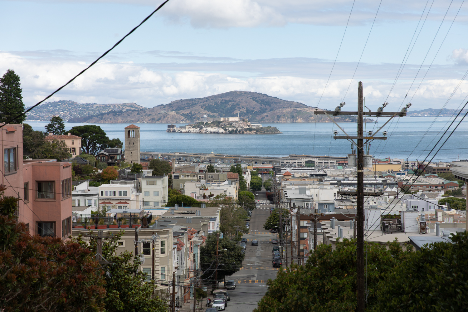
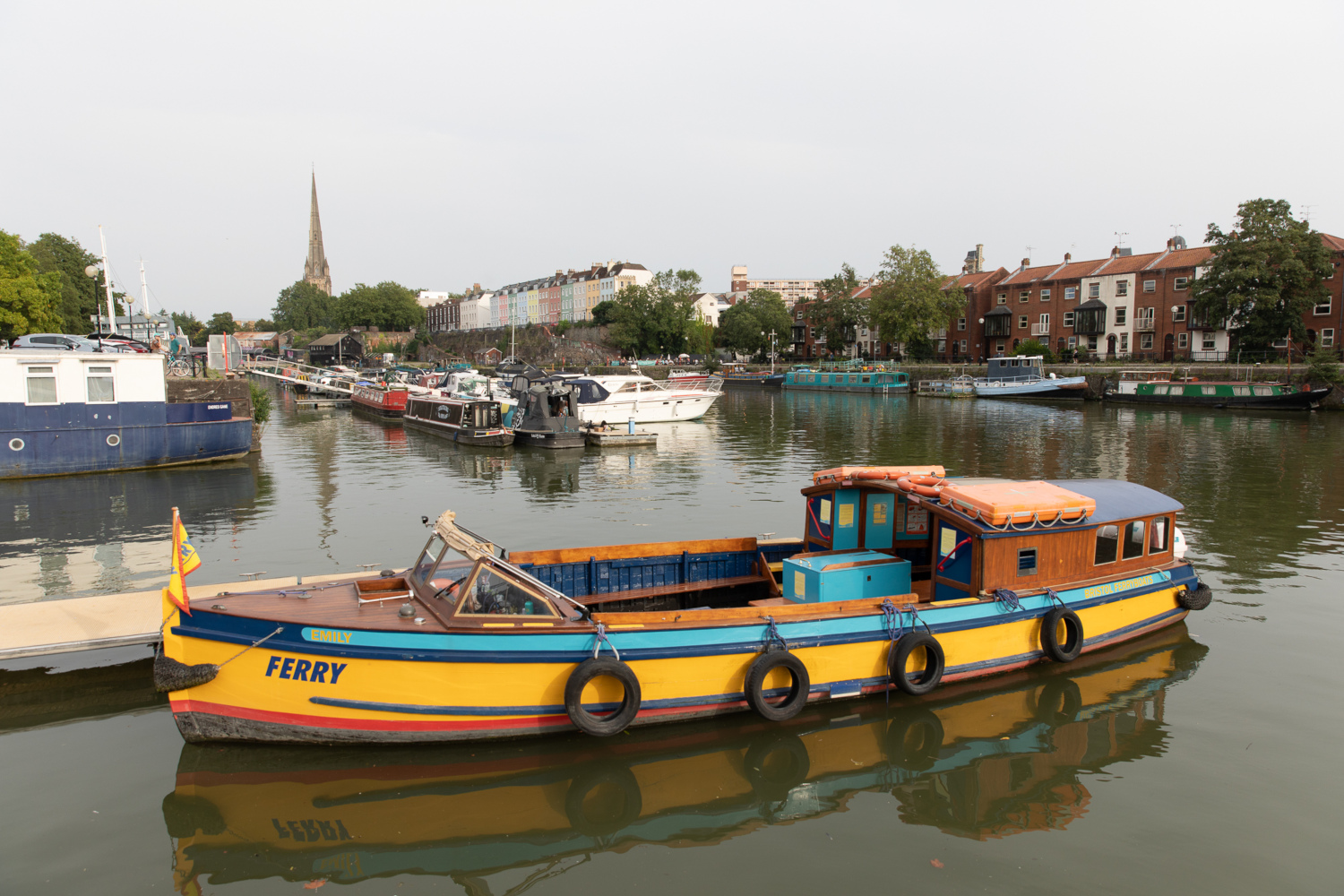
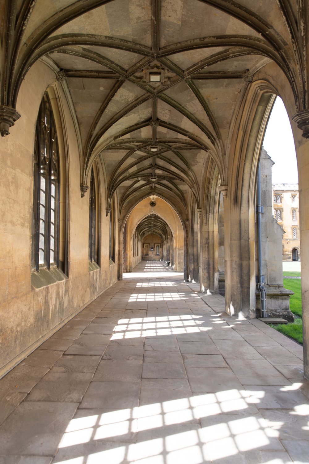
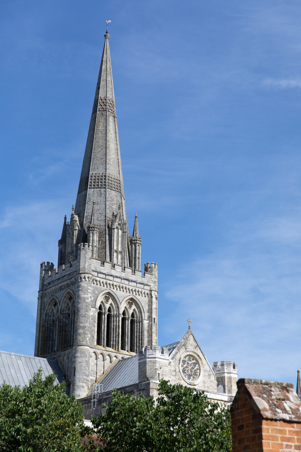
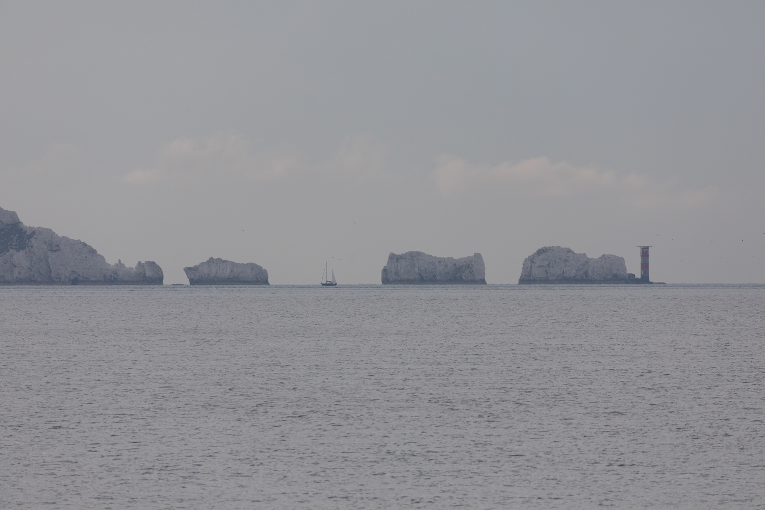
Two weeks ago I returned from a trip back to the UK for a few weeks, stopping off in San Francisco for a few days on the way out, and I have almost finished processing the DSLR photos I took, so this is just a quick post containing a single photo each from some of the locations I visited whilst away.
This month I bought and received a new Apple MacBook Pro (M2 Pro, 14-inch, 2023) with the aim of replacing my own Apple MacBook Pro 15-inch (Intel) 2015 model which I bought in 2016. The MacBook Pro 15 still does work, but the battery life is awful now (I could have it replaced, which I’ve done several times with laptops in the past), the internal fans barely work, and the rubber around the screen is disintegrating, so with a trip back to the Northern Hemisphere planned next month, I thought it was time for a replacement.
A year ago I was provided (on loan) a work-provided MacBook Pro 14 M1 Pro (see previous benchmarks) which I’ve been using a bit, so I knew mostly what to expect in terms of performance and from the laptop in general, but I was curious to compare the performance of the M2 Pro against the M1 Pro (and the old Intel machine).
It’s not going to be a completely fair apples-to-apples comparison, as the work-provided MacBook Pro 14 M1 Pro processor is the 10-core version which has two extra performance cores than the baseline did - having eight performance cores and two efficiency cores - and the M2 Pro I’ve just bought is the baseline model - with six performance cores and four efficiency cores - but it should provide a rough indication of what performance to expect.
The Xcode / Apple Clang compiler versions are also different: My MacBook Pro 15 (Intel) is still running quite an old MacOS version, with an older compiler which I don’t want to update, and while I did install Xcode 14.3 on the 2021 MacBook Pro M1 Pro (as well as the command line tools) in order to attempt to match what I’d just installed on my new 2023 MacBook Pro M2 Pro, clang --version still shows version 13.1.6, whereas my new 2023 M2 Pro MacBook Pro shows 14.0.3 being used, so I’m not really sure what’s going on there, as Xcode -> About Xcode shows Version 14.3.1 as I’d expect on both MacBook Pro 14 machines (and both have the command line tools for that version of Xcode installed).
The MacBook Pro 14s are both running MacOS Ventura 13.4.
Tests:
Copying what I did in the test last year, I’ll be using two of my apps as benchmarks: my Mint interpreter language VM (originally based off Robert Nystrom’s excellent Crafting Interpreters Lox language tutorial) but with additional functionality and performance improvements, which I’ll use to benchmark two Mint scripts as single-threaded tests, and also my Imagine pathtracing renderer, which has native SSE intrinsics support for Intel and native Neon intrinsics support for ARM, which I’ll run in both single- and multi-threaded scenarios.
Both apps will be compiled with -march=native on the Intel side and -mcpu=native on the Apple Silicon / ARM side, using the clang version on the machine in question, as well as optimisation level: -O3.
The two Mint script tests will be loop value calculation as Test 1:
var a = 1;
for (var i = 0; i < 100000000; i += 1)
{
    a = (i + i + 3 * 2 + i + 1 - 0.42) / a;
}
print a;
and a variation of Project Euler 21 to calculate the sum of all Amicable numbers under 15,000 as Test 2.
The Imagine rendering tests will render three different scenes in both single- and multi-threaded mode.
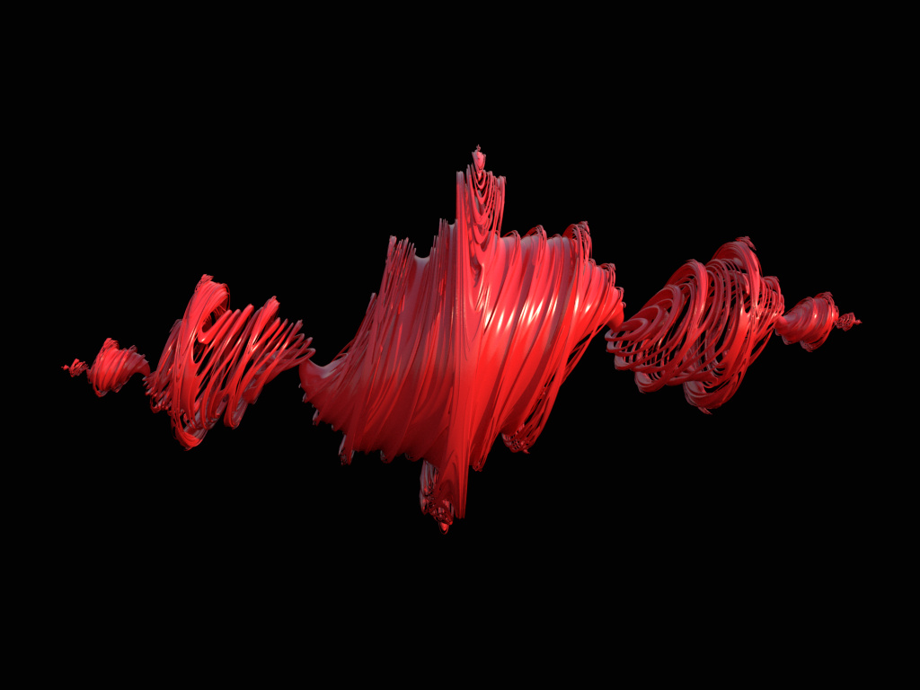
The first render will be the same maze scene with spherical area lights that I used in the test last year (example image above), but with different settings:
resolution will be 256 x 256, 256 samples-per-pixel will be used, but this time only one next-event light sample will be taken each path vertex.
The general ray traversal and ray intersection will utilise SIMD, but the (fairly expensive) perfect light sphere sampling is scalar, and very unlikely
to be vectorised by the compilers themselves.
The second render will be a 450 x 338 resolution render of a Signed Distance Field primitive of a Julia Fractal (example image above, although with different settings), which is quite expensive to evaluate,
and also does not have any SIMD utilisation for the SDF evaluation / intersection. There’s a physical Sky IBL in the scene as a light, and 144 samples-per-pixel will be used, with 3x3 Blackman Harris pixel filtering being used.
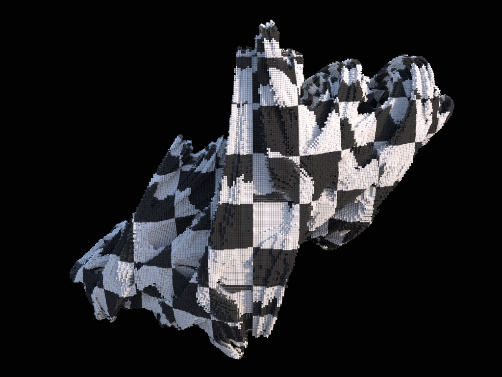
The third render will be a 450 x 338 resolution render of 2,326,299 instanced mesh cubes in the (pre-calculated) shape of a Julia Fractal, which will
fully-utilise SIMD instructions for ray traversal in the BVH and for ray / primitive intersections. Again, there’s a physical Sky IBL in the scene,
144 samples-per-pixel will be used, but this time no pixel reconstruction filtering will be used (so effectively Box 1x1).
These tests will all be done on (close to fully-charged) battery power - I discovered in the tests last year that Apple doesn’t seem to down-clock on battery power - and I will also wait between test runs for the processor temperatures to be below 50 degC before running the next test, to try and reduce the impact of thermal throttling.
All tests will be run three times, and results below will show the mean average of those numbers.
Results
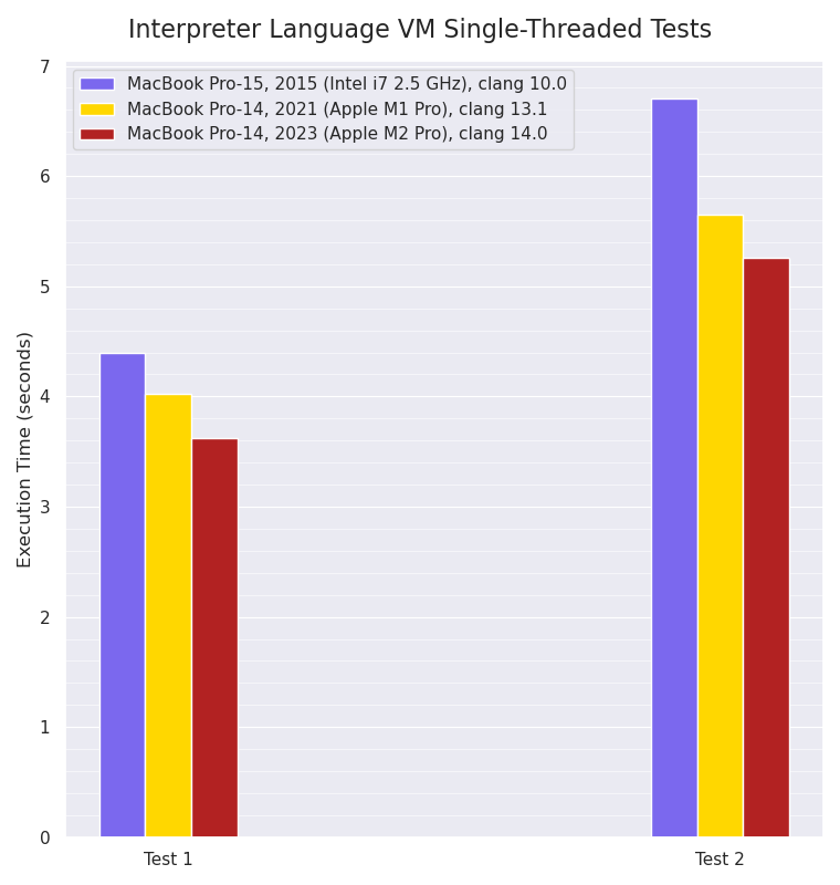
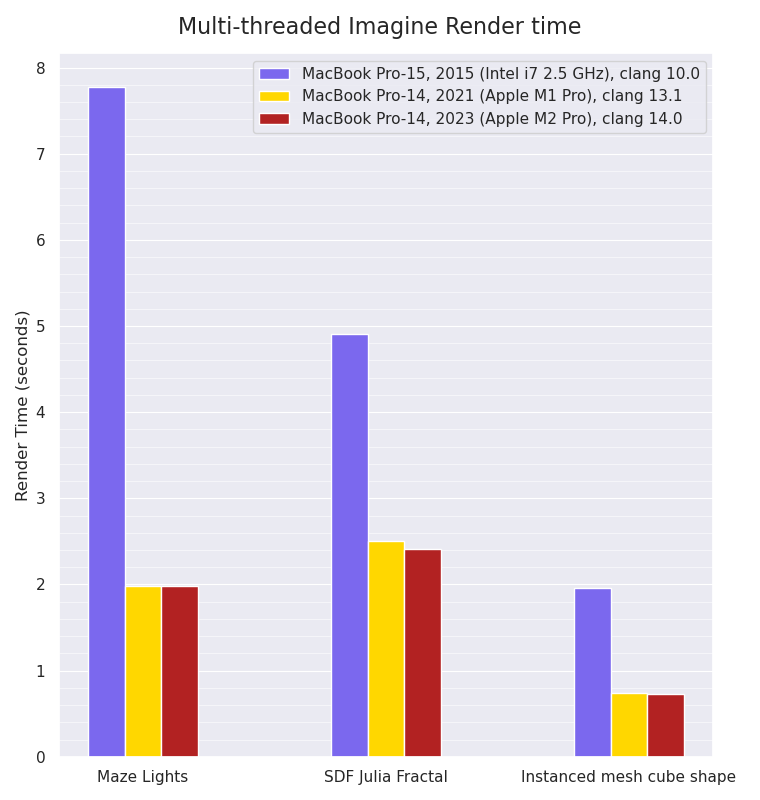
Single-threaded Mint VM interpreter:
Single-threaded Mint interpreter VM benchmarks, smaller values are better:
For these single-threaded tests, the M2 Pro has a small improvement over the M1 Pro’s performance, which itself is around 10-16% faster than the eight year old Intel i7 processor. As mentioned last year however, I think this is very likely because the Mint VM execution is often branch-prediction constrained within the main VM bytecode interpreter loop, so there’s a limit to the amount of Instruction-Level Parallelism that’s achievable from the eight-wide M1 Pro and M2 Pro.
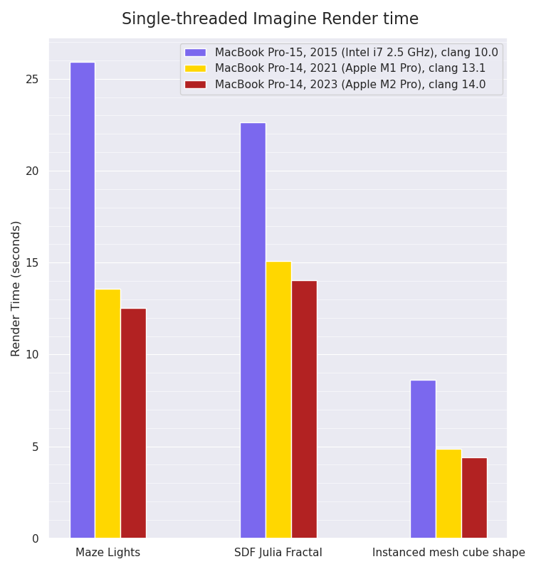
Single-threaded Imagine rendering:
Single-threaded Imagine rendering benchmarks, smaller values are better:
The single-threaded rendering tests, which have a lot more floating point calculations and SIMD usage, show a small performance improvement for the M2 Pro over the M1 Pro. Intriguingly, the Maze Lights scene is the test with the biggest performance increase (almost 2x faster) from the Intel machine to the Apple M1 Pro: the other tests show slightly smaller gains, which I wouldn’t have expected. Without further microbenchmarks of various isolated parts of those tests, it’s difficult to guess why that might be, but the different render tests do exercise different calculations and code paths.
Multi-threaded Imagine rendering:
Multi-threaded Imagine rendering benchmarks, smaller values are better:
The multi-threaded rendering tests show that due to the fact the M1 Pro machine has eight performance cores and two efficiency cores, whilst the M2 Pro
machine only has six performance cores and four efficiency cores, the M2 Pro machine is only very slightly faster in the SDF Julia Fractal render scene than the M1 Pro machine, and ties in the other two tests. Once again, the Maze Lights scene shows the biggest performance increase - almost 4x faster - from the Intel CPU to the Apple Silicon ones, with the other two tests showing a less dramatic difference (between 2x to 3x faster).
Conclusion
I think a not too bad showing for the baseline model: the M2 Pro can beat the M1 Pro by a small margin in all single-threaded tests, and can either just about equal or slightly beat the M1 Pro which has more performance cores (but two less efficiency cores) in the multi-threaded tests.
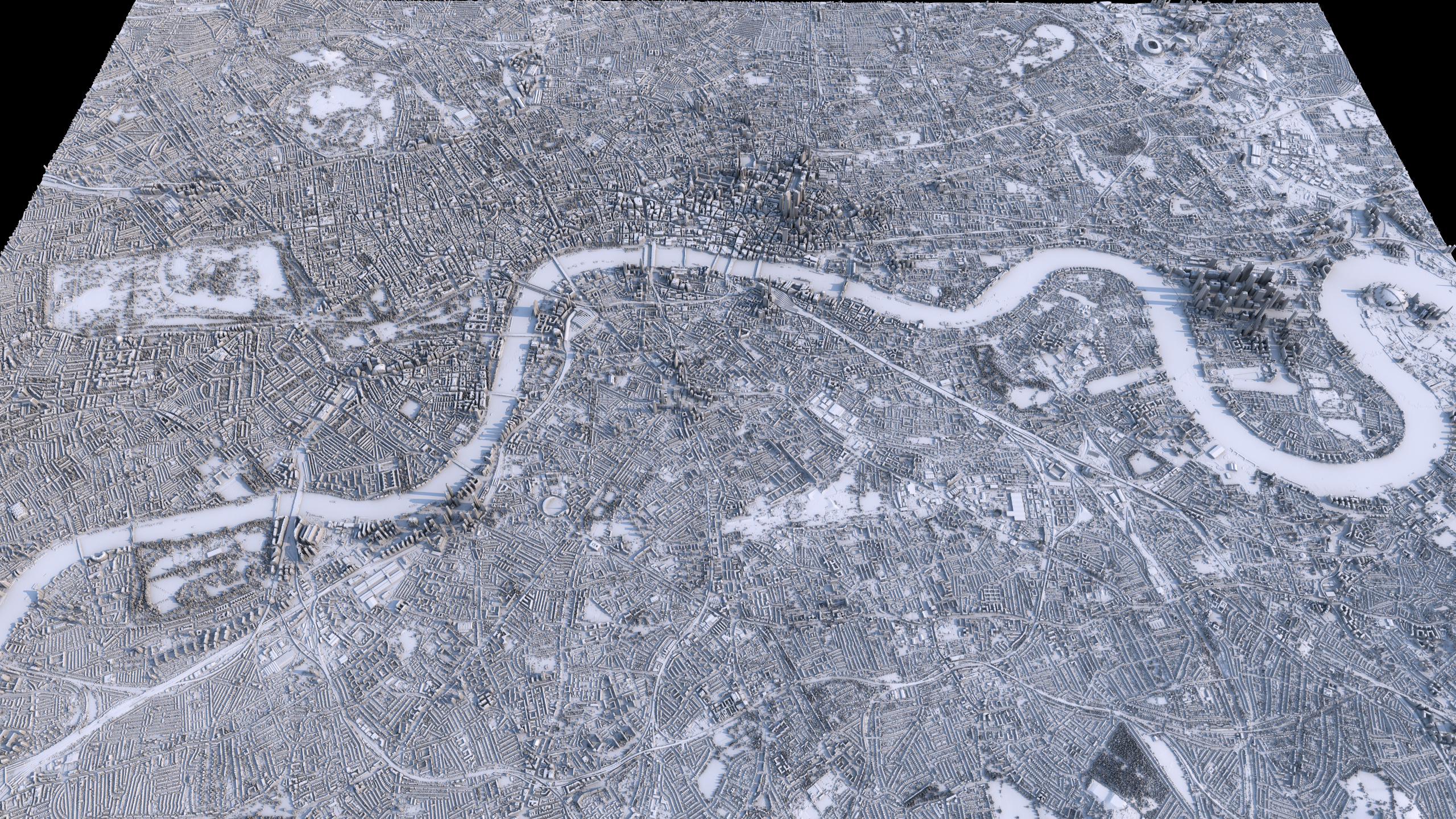
I’ve started experimenting with rendering representations of LIDAR-measured Digital Surface Model map datasets, which in contrast to Digital Elevation Model or Digital Terrain Model datasets - which are more common, and only consist of the raw terrain elevation data - have human-built structures in the height data (i.e. buildings). Previous Map Renderings (A full list of ones I’ve done so far can be found here) have involved DEM model data which just consists of the natural terrain, and in terms of scale, I’ve focused there on rendering entire countries or islands.
So I’ve been curious to try generating more detailed imagery of more localised areas, in particular of cities where human-made buildings and architecture are clearly visible, and here are some very early initial attempts with the raw DSM data for London.
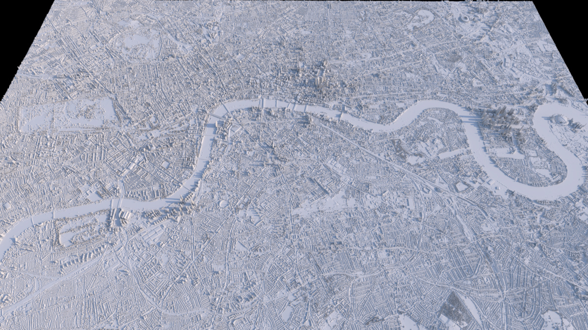
The above render (Full 2.5k Render) is just a plain render of the surface being displaced by the LIDAR dataset values, using data from the UK’s Environment Agency from the LIDAR Composite DSM 2022 - 1m dataset showing central London.
(Note that when downloading the tilesets from the website, the category defaults to the ‘DTM’ Digital Terrain Model version which doesn’t have buildings, so ensure you switch to the ‘DSM’ version if that’s the one you want.)
When zoomed out and viewed from above, the fidelity seems pretty good: showing buildings, bridges and trees in nice detail.
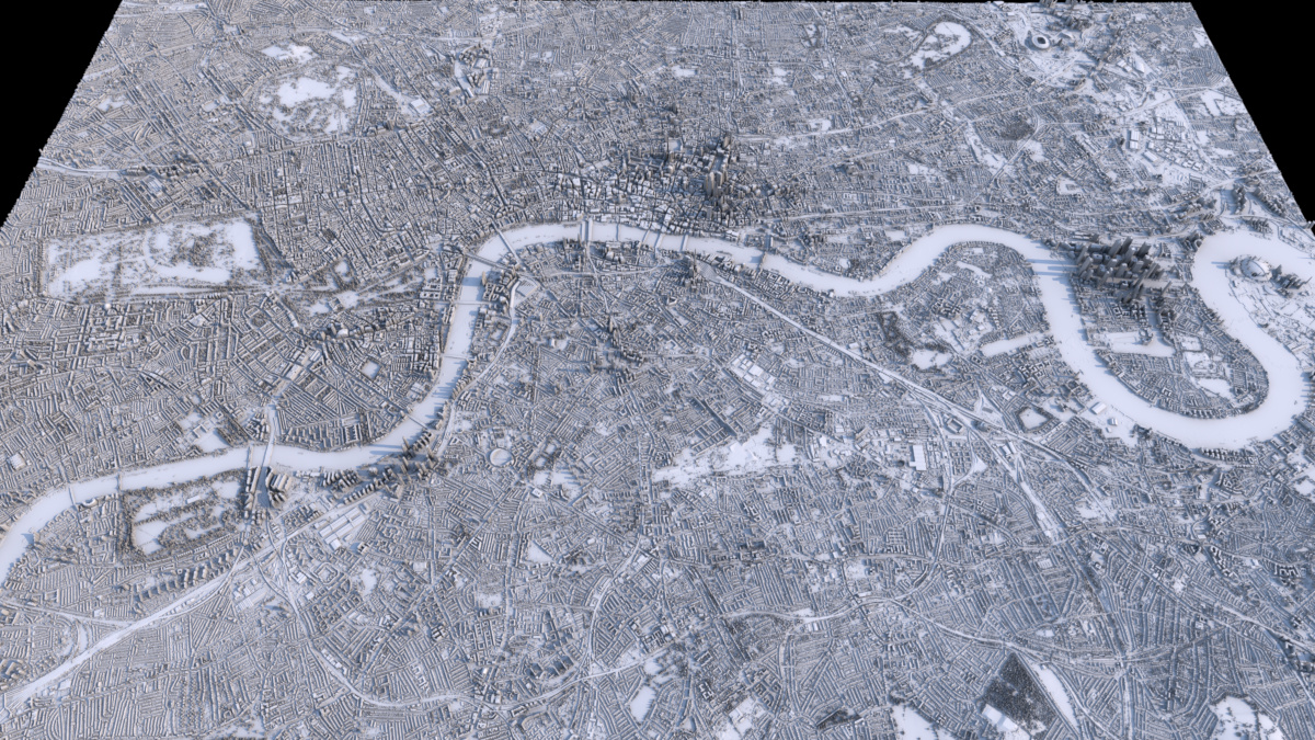
Using a slightly less boring shader look - an occlusion shader, driving a diffuse surface colour gradient - gives what I think is a quite pleasing effect, accentuating the streets:
(Full 2.5k Render)
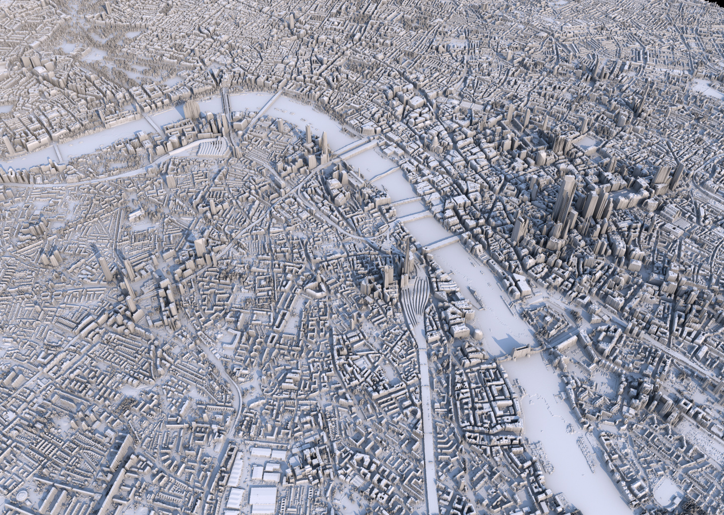
The height scale I’ve used is not physically-based to real scale (to the horizontal extents) currently: I’ve just eyeballed something which looks fairly reasonable, but I think it’s probably a bit too high still.
Once you start to look at the resulting generated surface in a bit more detail from closer up or at a more horizontal viewing angle, then the understandable limitations of the fidelity and format (2D single height values) of the data becomes a bit more apparent, especially in situations like overhangs, where single DEM/DSM values per point on a 2D surface are obviously limited. This can be seen in representations of bridges (there’s no gap underneath them), Tower Bridge and the London Eye in the below alternative view render:
London did seem to previously have some 25 cm resolution DSM datasets available at some point, but data.gov.uk doesn’t seem to have those any more, although they may still be part of other overall datasets, so I’ll try and find them. That won’t solve the ‘overhang’ problem (you’d need to use a full 3D point-cloud representation for that), but it should provide extra detail which might be interesting.
I’d also like to try and colour in water areas (and maybe foliage-heavy areas like parks) specific colours to add a bit more contrast and produce some more “artistic” versions, which I’ll look into doing over the next few months. Looking at rendering other cities that have more hilly terrain than London might be interesting as well, in order to have a combination of terrain and human-built buildings. I did look to see if I could find LIDAR DSM models of Wellington, NZ (where I’m currently living), which has an interesting combination of the two (although most buildings are quite small on the hills here), but I could only find DEM terrain models (without structures) for NZ. Cities like San Francisco are likely to have good data in this category, and I’ll have a look at other cities as well to see what’s available.
In a third instalment of attempting to copy images I’ve seen online with my own code, I recently saw some images generated by Johannes Kröger, whereby he ‘integrated’ or averaged a satellite image taken every day from the Suomi VIIRS Satellite into a final image which approximated the median average of cloud cover over the year.
He had an original blog post in 2019 here, and a follow-up in 2021 with more technical details here.
I liked the look of the imagery, and was curious how easy it would be to generate myself, and on top of that, was also interested in generating per-quarter/season images rather than ones only for the entire year, in order to try to see obvious variations between seasons.
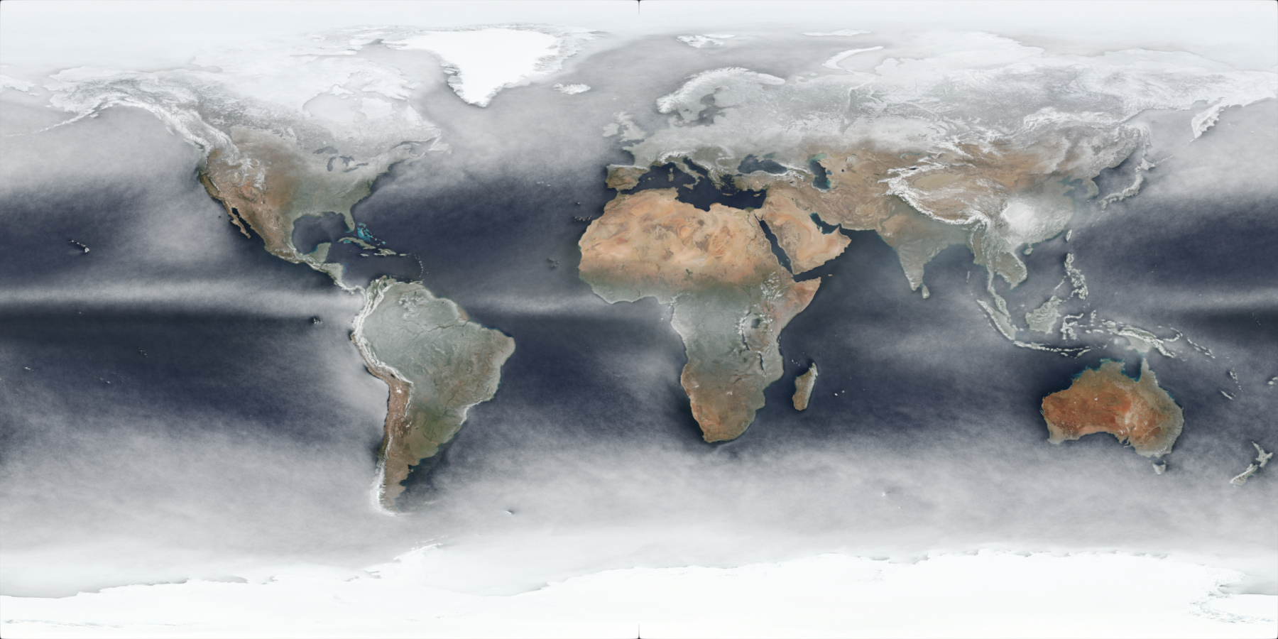
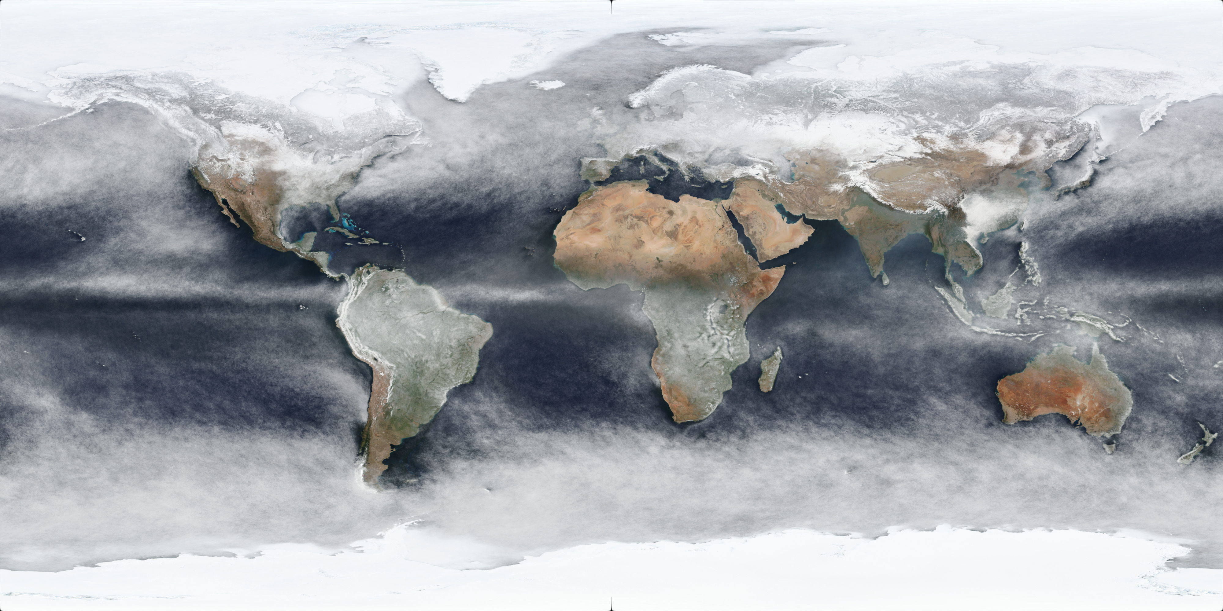
It should be noted that these will be approximations: the source imagery is taken once a day - generally around noon (although it varies per day per location due to the satellite orbits, as can be seen when comparing adjacent per-day images) - and these processed imagery will include snow/ice cover as well, as shown in this preview of the North Pole area for the approximate average pixel colour of all 366 days of 2020:
Johannes Kröger’s 2021 blog post contained a bash script example which used the gdal_translate command of the Geospatial Data Abstraction Library (GDAL) suite of tools to download the source imagery from NASA’s Global Imagery Browse Services (GIBS) using a web API which provides tiled images, allowing the download of entire images from source tilesets.
I needed to modify his script to get it working (the ‘TileLevel’ needed to be changed), but I didn’t really want to use bash shell anyway, so I wrote a Python script to do the same thing, but added the functionality to also download imagery for multiple days at a time as a date range, and to also use multiple threads to download multiple images in parallel (downloading a single set of tiles for a single date is quite slow), and also added a ‘cubic’ resize filter to the gdal_translate command line args.
The Python script in its final form (albeit slightly sanitised - the save path will need to be changed in order to use it) can be downloaded here.
Note that the size of the images are quite large on disk given their fairly high resolution.
Johannes Kröger did give instructions on how to use available software (GDAL in his case) to perform the ‘averaging’ operation, but this was the bit I wanted to fully implement in code myself: I already had fairly comprehensive Image reading and processing infrastructure code of my own, so modifying it to perform ‘mean’ averages was pretty trivial: to just loop through the entire planar image of each final .tif file for each day’s imagery, and add them all together, and then divide each pixel value by the total number of images. This worked, however the result of using ‘mean’ average pixel values produces an image which does not really represent (at least directly) pixel values that actually occurred in terms of cloud cover: it’s an interpolation, and doesn’t show the pixel values that were most common (i.e. the colour values which occurred the most over the duration of the year for each day).
To find the most common pixel values over the course of the year for each pixel position in the imagery, the ‘median’ average needs to be used, and to calculate this was more development work, as a ‘median’ average requires having all the values for a pixel sorted in order (of luminance/brightness generally), and doing that for 365 16k images at full float32 precision in linear space (despite the source data being in sRGB 8-bit space, it’s generally a good idea to pull pixel values into ‘linear’ colourspaces in order to do computation on them) would take around 1.61 GB of memory (16,384 x 8,192 pixels x 3 channels x 4 bytes) per image, and so it was not going to be feasible to store all 365 entire planar images in memory at once (that would take at least 587 GB of RAM). I could have quantised the pixel values a bit whilst still keeping them in linear space (say to half float16 precision) or something lower with fixed-point, but that still wouldn’t have been anywhere near enough of a reduction, so it was clearly going to require breaking the image up into chunks, so I decided to process the ‘median’ average values in tiled regions, given the source TIFF images were in tiled form anyway, and so reading the individual tile regions for each source image would be easy and pretty fast to iterate through them.
I ended up with an algorithm that would for each tile region (256 x 256 size for the images I had downloaded) of all images (they all obviously have to be the same resolution), iterate through all images for the year, but just for that single tile region at a time, and accumulate all pixel values for all images into arrays per pixel position within the tile region. This way, the total memory usage was “just” the tile size dimensions (256 x 256) x 3 x 4 bytes = 786 KB (plus a bit extra for data structure overhead). Total memory cost for 365 tiles would then be around 287 MB, which is much more reasonable. Then for each pixel position within the tile region, all the pixel values for that pixel position from all the source images needed to be sorted (by luminance), and then the middle ‘median’ value picked. This single RGB value per pixel position within the tile region could then be baked down to a single final image buffer for the tile region, and the memory allocation of all previous pixel values for all 365 tile images could be freed, and then the next tile region could be processed in the same way, for all tile regions in the source images.
Then, finally, these per-tile-region final images would be re-assembled based off their tile position into a final image of the resolution of the original full source images, and this result saved to a final full output image. Given enough memory (my main Linux desktop has 32 GB), it was also trivial enough to process the per-tile-region reading of all source tile images for that tile region and ‘median’ sorting and evaluation in multiple threads, as each tile region could be completely independent from one another, speeding up processing considerably.
Processing 365 16k images into a final output image took around 14 minutes using 12 threads on a Ryzen 5900X, which wasn’t too bad, and there’s still a bit of room for further optimisation I think.
After experimentation with the output, I also added thresholding so as to not accumulate pixel values that were black: the poles of the earth in the satellite imagery were occasionally black, depending on the orbit and that affected the output values a bit.
I had tried to produce average images for the 2022 year, but it turns out the Suomi VIIRS Satellite was missing imagery for late July 2022 and the first half of August 2022, so I used 2021 instead which seemed to have full imagery, and also did 2020 for comparison purposes.
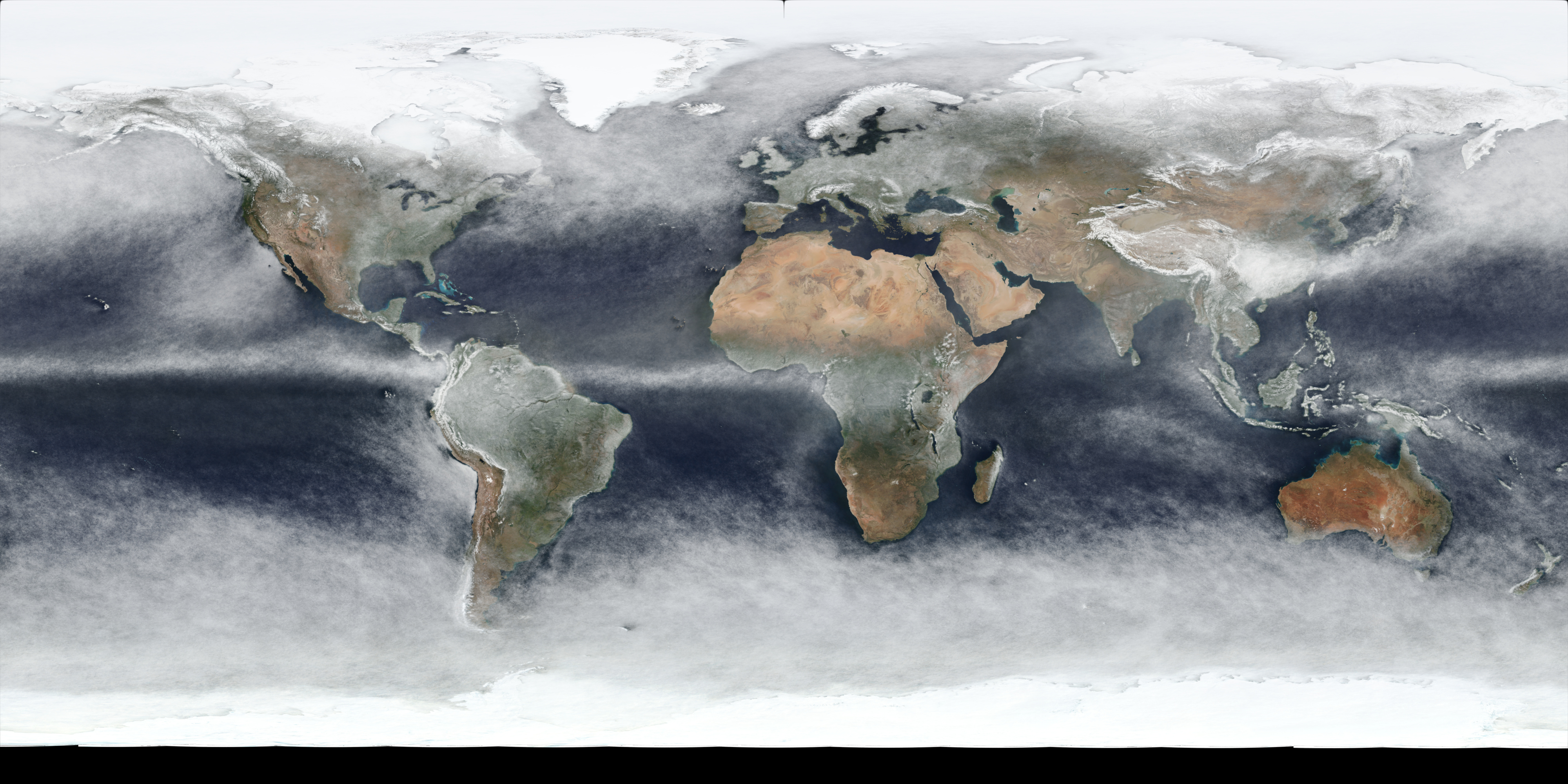
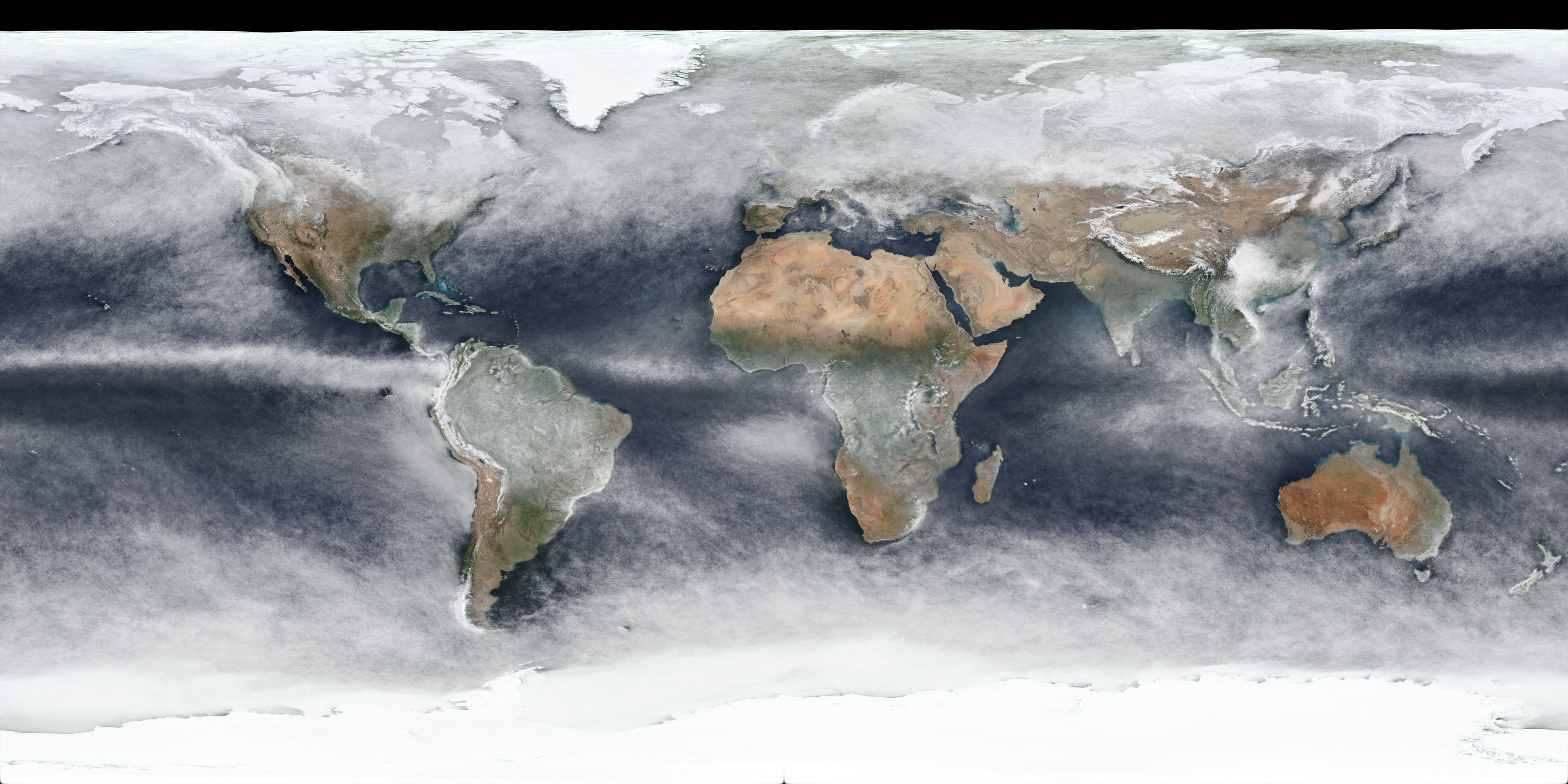
The output result of this for all days in 2021 is this image (full 4k version link):
which is using the same WGS 84 projection that the source images used. Reprojected to a more “true-size preserving” projection - Robinson Projection - provides this image (full 4k version link):
Below is a table containing links to 4k versions of per-quarter images for 2021:
The per-quarter versions do clearly show (as expected) obvious differences in seasons, although there may well be yearly variation as well, and snow/ice cover changes will also be included in the changes.
I’m keen to produce more of these in the future - ideally at higher resolution for more localised regions with better projections - in addition to attempting to generate (mostly) cloudless imagery similar to the famous “Blue Marble” images, to see how easy it is to detect clouds vs snow/ice on the ground: either with large vs. small changes day-to-day between images, or I wonder if it’s possible to use Infrared imagery to detect if colours are likely clouds or not, or by using some of the other output info from the VIIRS sensors.
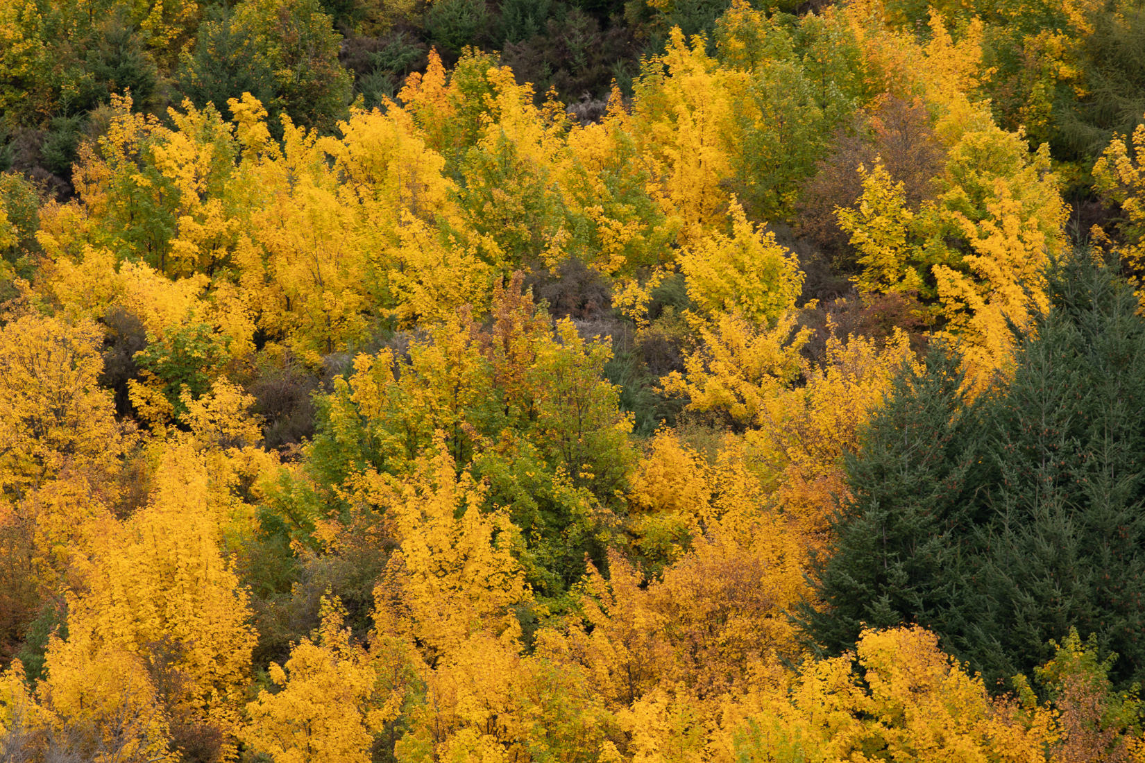
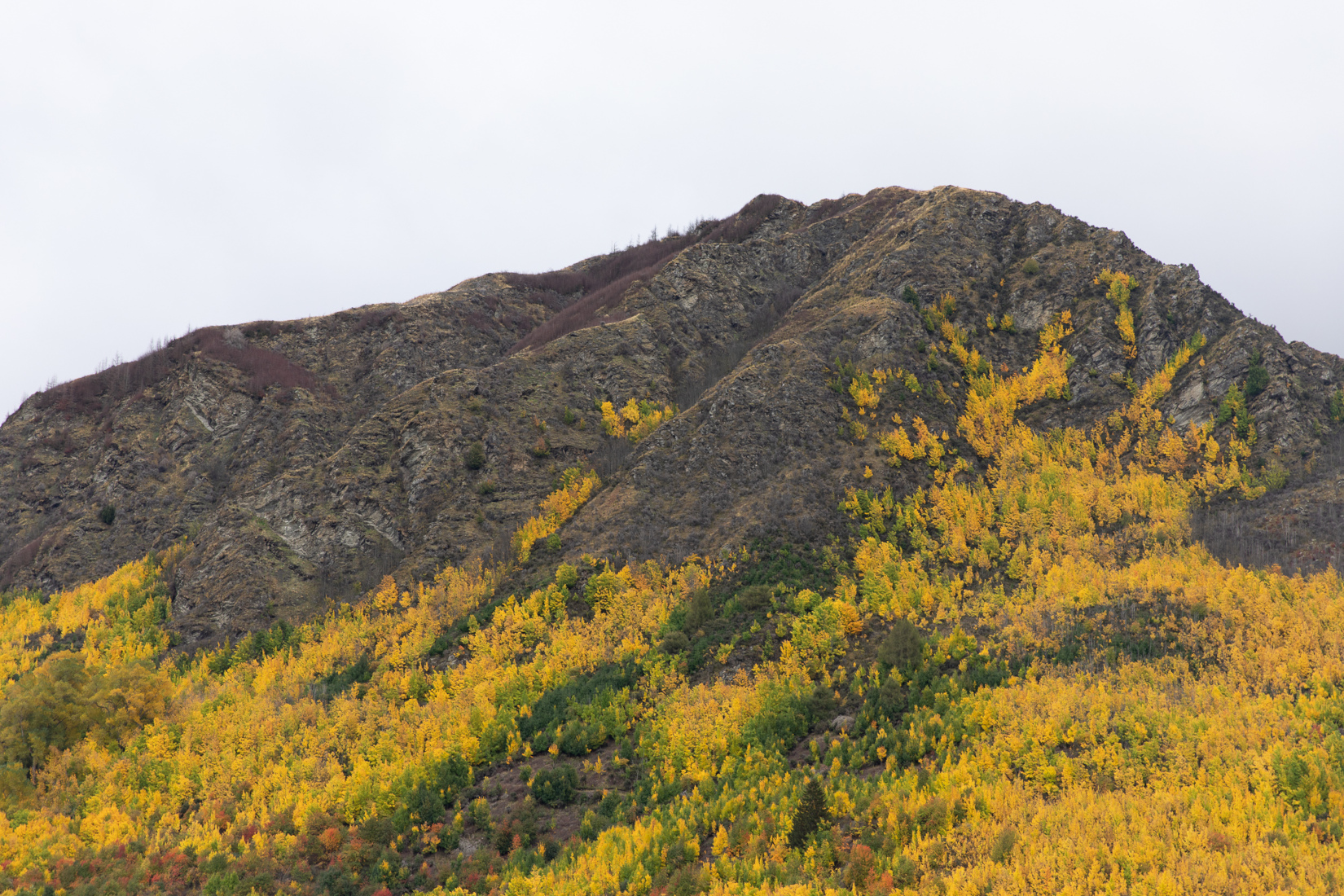
Last week I spent a few days down in the South Island around Queenstown and Wanaka, mainly to try and photograph the Autumn Colours. Apparently the term for this is a “Leaf Peeper”!
I’ve been several times before, but always in Spring or Summer, so this was the first time I’d seen any of the South Island in Autumn.
Whilst there is a bit of colour in Autumn in the North Island in places (in parks north of Wellington for example), there’s not much that I’ve seen in general (at least in comparison to the Northern Hemisphere), so it was a nostalgic memory of Autumn in the Northern Hemisphere, seeing the very widespread colours that occur there and I grew up with.
I think I’m correct in saying that almost all of the trees in New Zealand that have leaves which change colour in the Autumn are “exotic”, non-native species that have been imported from Europe, North America and Japan, with there being very few native deciduous trees (most are evergreen), and of those very few of them actually change colour.
Maples, English Beech (the native New Zealand Beech species are evergreen from what I can tell), Gum, Cherry and Horse chestnut trees seem almost certain to have been imported by early settlers, and the fact they seem to mostly be found along rivers and near settlements rather than being found out further away in more remote parts of the landscape seems to re-enforce that theory, but it’s difficult to know for certain.
Regardless, they do provide a very noticeable splash of colour on top of New Zealand’s already beautiful scenery in the area, and I did get some nice photos I’m happy with.


