For some of the more recent LIDAR maps I’ve been producing over the past six months - see this post with initial experimentation, and the resulting full-sized maps I’ve rendered so far can be found here - the source data has been in Pointcloud form rather than as a ‘flat’ raster image format (GeoTIFF) of just the DSM height values, and so it requires different processing in order to clean it up, and then convert it into a ‘displacement’ image map so I can render it as a 3D geometry mesh.
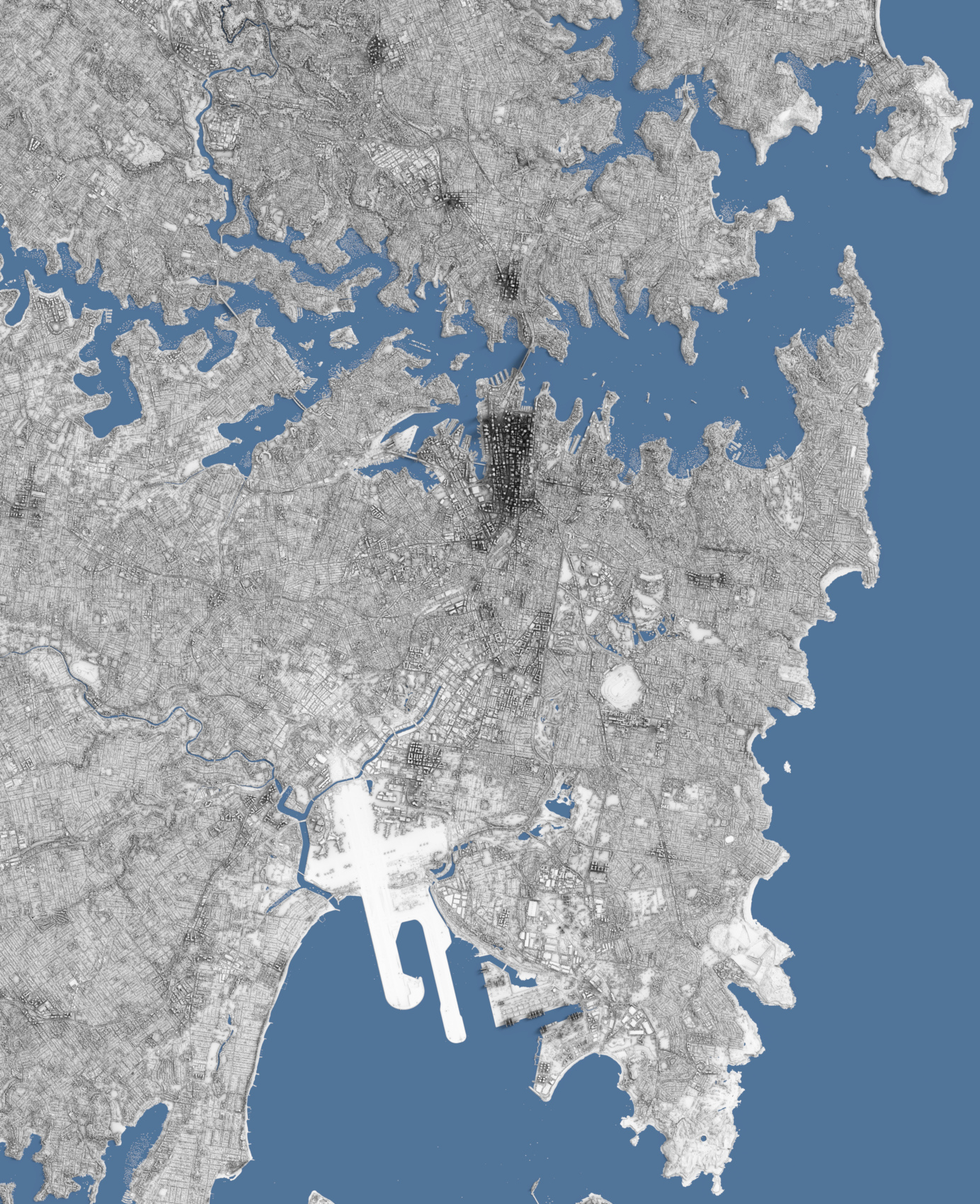
The below rendering is of Sydney, and uses a conversion from Pointcloud source data (available from https://elevation.fsdf.org.au/ as .laz files):
The data being in Pointcloud format has both advantages and disadvantages over more simple raster height images: one of the main advantages is that there’s often (depending on the density and distribution of the points) more data per 2D area measure of ground, and each point has separate positions and attributes, rather than just being an average height value for the pixel as it is in raster image format. This means that theoretically it’s easier to “clean up” the data and remove “bad” points without destroying surrounding data. Another advantage is that being fully-3D, it’s possible to view the points from any direction, which is very useful when visualising and when looking for outliers and other “bad” points.
The disadvantages are that the data is generally a lot heavier and takes up more memory when processing it - three 8-byte double/f64 values need to be stored for the XYZ co-ordinates - at least when read from LAS files, as well as additional metadata per point (although there are ways to losslessly compress the memory usage a bit) - in addition to needing different tools to process than with raster images. Newer QGIS versions do now support opening and viewing .LAS/.LAZ Pointclouds (both in 2D and 3D views), although on Linux I’ve found the 3D view quite unstable, and other than being able to select points to view the classification, there’s not much else you can do to process the points, other than some generic processing which uses the PDAL tooling under-the-hood. It also appears QGIS has to convert the .LAS/.LAZ formats to an intermediate format first, which slows down iteration time when using other processing tooling side-by-side.
PDAL is a library for translating and manipulating Pointcloud data (similar to GDAL for raster data / GeoTIFFs, which QGIS uses for a lot of raster and vector operations under-the-hood), and it has quite a few useful features including merging Pointclouds (a lot of the source DSM Pointcloud data is only available as tiles of areas, and so the data needs to be merged to render entire cities, either before converting to a raster displacement map or after), filtering points, rejecting outliers and converting to raster image heightfields.
I have however found its memory usage somewhat ‘excessive’ for some operations, in addition to being slow (despite the fact it’s written in C++).
Because of this - and also to learn more about Pointclouds and the file formats - I’ve started to write my own basic Pointcloud processing utility application (in Rust - the las-rs crate allowed out-of-the-box reading and writing of the .LAS/.LAZ Pointcloud formats which was very useful to get started quickly), which despite not really doing anything especially ‘fancy’ for some of the more simple operations like merging .LAS/.LAZ files - it just does a naive loop over all input files, filtering the points within based on configured filters and then accumulating and saving them to the output file - uses a lot less memory than PDAL does, and is quite a bit faster, so I’ve been able to process larger chunks of data with my own tooling and with faster iteration time.
The one area I haven’t tackled yet and am still using PDAL for is conversion to output raster image (GeoTIFF) - which I then use as the displacement map in my renders - however I hope to implement this rasterisation functionality myself at some point.
I am on the lookout for better Pointcloud visualisation software (in particular on Linux - a lot of the commercial software seems to be Windows or Mac only). QGIS’ functionality is adequate but not great, and is fairly lacking in terms of selection, and other open source software I’ve found like CloudCompare seem a bit unstable (at least when compiling from source on Linux), and it’s not clear how well it’d scale to displaying hundreds of millions of points at once.
I have found displaz which is pretty good for displaying very large Pointclouds (it progressively draws them, and seems to store them efficiently in memory), however it has no support for selection or manipulation of points (by design), so I’m still looking for something which caters to that additional need: in particular the selecting of outlier points interactively and culling them.
I’ve started experimenting with rendering representations of LIDAR-measured Digital Surface Model map datasets, which in contrast to Digital Elevation Model or Digital Terrain Model datasets - which are more common, and only consist of the raw terrain elevation data - have human-built structures in the height data (i.e. buildings). Previous Map Renderings (A full list of ones I’ve done so far can be found here) have involved DEM model data which just consists of the natural terrain, and in terms of scale, I’ve focused there on rendering entire countries or islands.
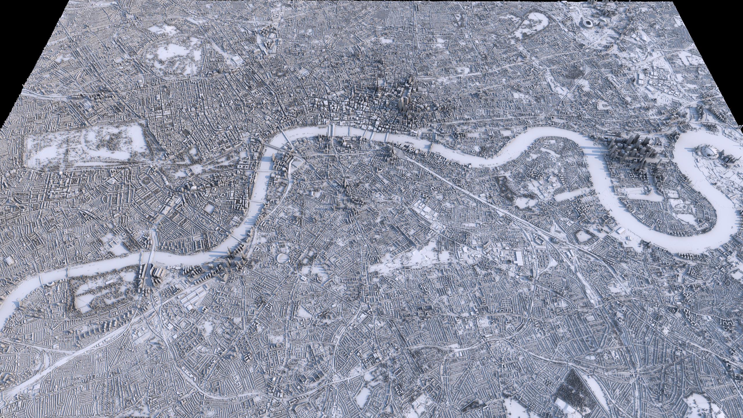
So I’ve been curious to try generating more detailed imagery of more localised areas, in particular of cities where human-made buildings and architecture are clearly visible, and here are some very early initial attempts with the raw DSM data for London.
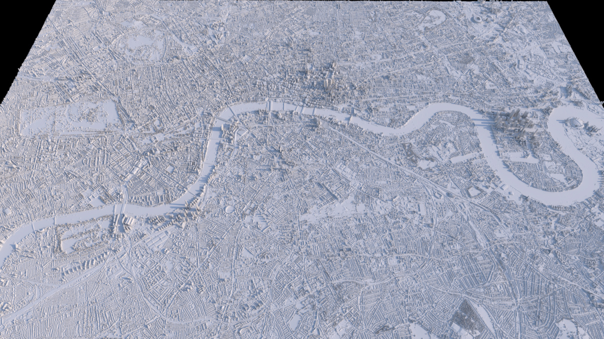
The above render (Full 2.5k Render) is just a plain render of the surface being displaced by the LIDAR dataset values, using data from the UK’s Environment Agency from the LIDAR Composite DSM 2022 - 1m dataset showing central London.
(Note that when downloading the tilesets from the website, the category defaults to the ‘DTM’ Digital Terrain Model version which doesn’t have buildings, so ensure you switch to the ‘DSM’ version if that’s the one you want.)
When zoomed out and viewed from above, the fidelity seems pretty good: showing buildings, bridges and trees in nice detail.
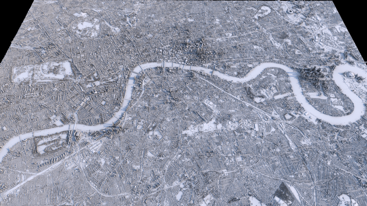
Using a slightly less boring shader look - an occlusion shader, driving a diffuse surface colour gradient - gives what I think is a quite pleasing effect, accentuating the streets:
(Full 2.5k Render)
The height scale I’ve used is not physically-based to real scale (to the horizontal extents) currently: I’ve just eyeballed something which looks fairly reasonable, but I think it’s probably a bit too high still.
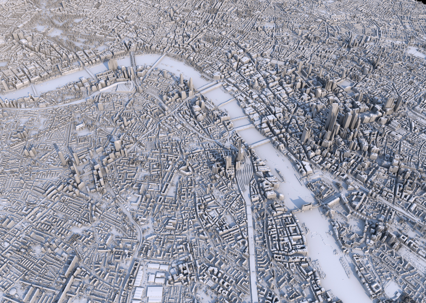
Once you start to look at the resulting generated surface in a bit more detail from closer up or at a more horizontal viewing angle, then the understandable limitations of the fidelity and format (2D single height values) of the data becomes a bit more apparent, especially in situations like overhangs, where single DEM/DSM values per point on a 2D surface are obviously limited. This can be seen in representations of bridges (there’s no gap underneath them), Tower Bridge and the London Eye in the below alternative view render:
London did seem to previously have some 25 cm resolution DSM datasets available at some point, but data.gov.uk doesn’t seem to have those any more, although they may still be part of other overall datasets, so I’ll try and find them. That won’t solve the ‘overhang’ problem (you’d need to use a full 3D point-cloud representation for that), but it should provide extra detail which might be interesting.
I’d also like to try and colour in water areas (and maybe foliage-heavy areas like parks) specific colours to add a bit more contrast and produce some more “artistic” versions, which I’ll look into doing over the next few months. Looking at rendering other cities that have more hilly terrain than London might be interesting as well, in order to have a combination of terrain and human-built buildings. I did look to see if I could find LIDAR DSM models of Wellington, NZ (where I’m currently living), which has an interesting combination of the two (although most buildings are quite small on the hills here), but I could only find DEM terrain models (without structures) for NZ. Cities like San Francisco are likely to have good data in this category, and I’ll have a look at other cities as well to see what’s available.
In a third instalment of attempting to copy images I’ve seen online with my own code, I recently saw some images generated by Johannes Kröger, whereby he ‘integrated’ or averaged a satellite image taken every day from the Suomi VIIRS Satellite into a final image which approximated the median average of cloud cover over the year.
He had an original blog post in 2019 here, and a follow-up in 2021 with more technical details here.
I liked the look of the imagery, and was curious how easy it would be to generate myself, and on top of that, was also interested in generating per-quarter/season images rather than ones only for the entire year, in order to try to see obvious variations between seasons.
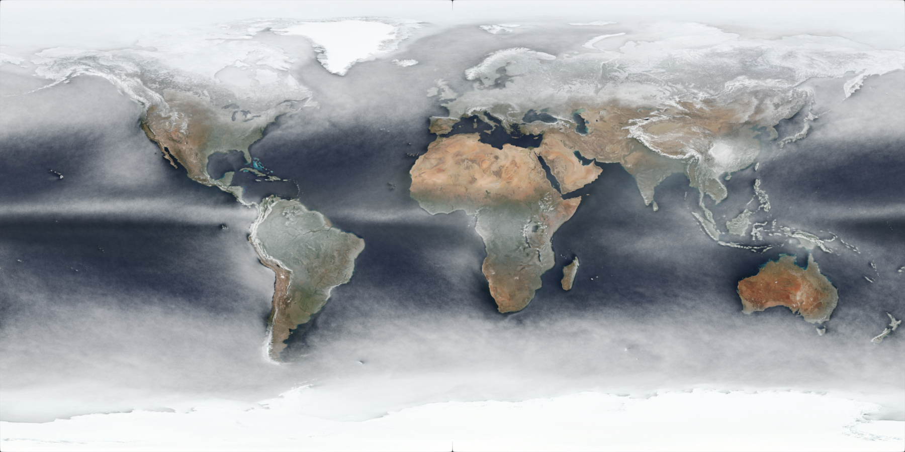
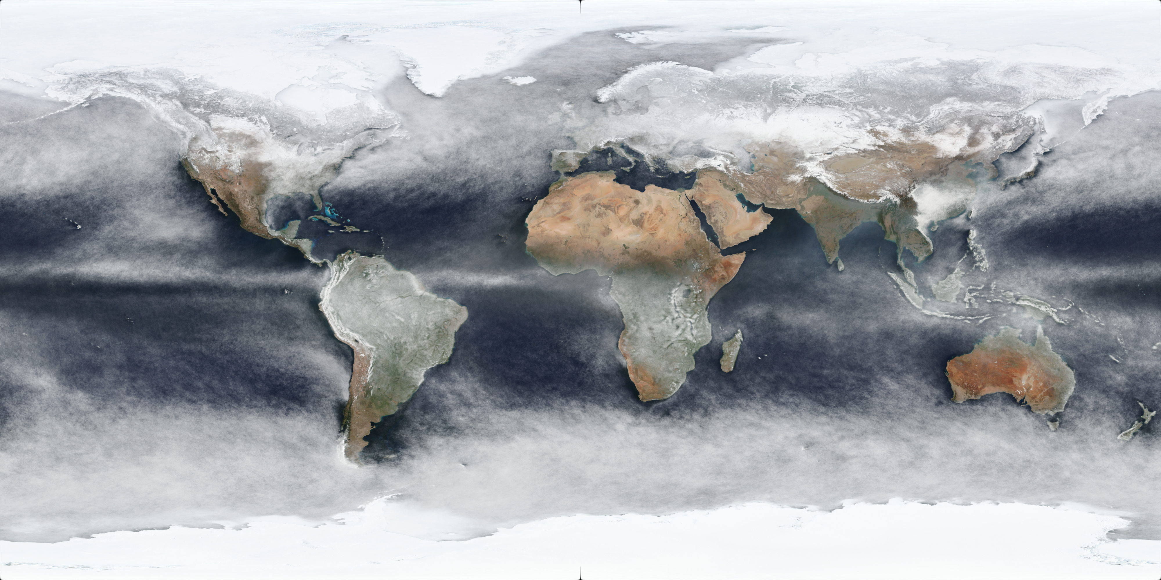
It should be noted that these will be approximations: the source imagery is taken once a day - generally around noon (although it varies per day per location due to the satellite orbits, as can be seen when comparing adjacent per-day images) - and these processed imagery will include snow/ice cover as well, as shown in this preview of the North Pole area for the approximate average pixel colour of all 366 days of 2020:
Johannes Kröger’s 2021 blog post contained a bash script example which used the gdal_translate command of the Geospatial Data Abstraction Library (GDAL) suite of tools to download the source imagery from NASA’s Global Imagery Browse Services (GIBS) using a web API which provides tiled images, allowing the download of entire images from source tilesets.
I needed to modify his script to get it working (the ‘TileLevel’ needed to be changed), but I didn’t really want to use bash shell anyway, so I wrote a Python script to do the same thing, but added the functionality to also download imagery for multiple days at a time as a date range, and to also use multiple threads to download multiple images in parallel (downloading a single set of tiles for a single date is quite slow), and also added a ‘cubic’ resize filter to the gdal_translate command line args.
The Python script in its final form (albeit slightly sanitised - the save path will need to be changed in order to use it) can be downloaded here.
Note that the size of the images are quite large on disk given their fairly high resolution.
Johannes Kröger did give instructions on how to use available software (GDAL in his case) to perform the ‘averaging’ operation, but this was the bit I wanted to fully implement in code myself: I already had fairly comprehensive Image reading and processing infrastructure code of my own, so modifying it to perform ‘mean’ averages was pretty trivial: to just loop through the entire planar image of each final .tif file for each day’s imagery, and add them all together, and then divide each pixel value by the total number of images. This worked, however the result of using ‘mean’ average pixel values produces an image which does not really represent (at least directly) pixel values that actually occurred in terms of cloud cover: it’s an interpolation, and doesn’t show the pixel values that were most common (i.e. the colour values which occurred the most over the duration of the year for each day).
To find the most common pixel values over the course of the year for each pixel position in the imagery, the ‘median’ average needs to be used, and to calculate this was more development work, as a ‘median’ average requires having all the values for a pixel sorted in order (of luminance/brightness generally), and doing that for 365 16k images at full float32 precision in linear space (despite the source data being in sRGB 8-bit space, it’s generally a good idea to pull pixel values into ‘linear’ colourspaces in order to do computation on them) would take around 1.61 GB of memory (16,384 x 8,192 pixels x 3 channels x 4 bytes) per image, and so it was not going to be feasible to store all 365 entire planar images in memory at once (that would take at least 587 GB of RAM). I could have quantised the pixel values a bit whilst still keeping them in linear space (say to half float16 precision) or something lower with fixed-point, but that still wouldn’t have been anywhere near enough of a reduction, so it was clearly going to require breaking the image up into chunks, so I decided to process the ‘median’ average values in tiled regions, given the source TIFF images were in tiled form anyway, and so reading the individual tile regions for each source image would be easy and pretty fast to iterate through them.
I ended up with an algorithm that would for each tile region (256 x 256 size for the images I had downloaded) of all images (they all obviously have to be the same resolution), iterate through all images for the year, but just for that single tile region at a time, and accumulate all pixel values for all images into arrays per pixel position within the tile region. This way, the total memory usage was “just” the tile size dimensions (256 x 256) x 3 x 4 bytes = 786 KB (plus a bit extra for data structure overhead). Total memory cost for 365 tiles would then be around 287 MB, which is much more reasonable. Then for each pixel position within the tile region, all the pixel values for that pixel position from all the source images needed to be sorted (by luminance), and then the middle ‘median’ value picked. This single RGB value per pixel position within the tile region could then be baked down to a single final image buffer for the tile region, and the memory allocation of all previous pixel values for all 365 tile images could be freed, and then the next tile region could be processed in the same way, for all tile regions in the source images.
Then, finally, these per-tile-region final images would be re-assembled based off their tile position into a final image of the resolution of the original full source images, and this result saved to a final full output image. Given enough memory (my main Linux desktop has 32 GB), it was also trivial enough to process the per-tile-region reading of all source tile images for that tile region and ‘median’ sorting and evaluation in multiple threads, as each tile region could be completely independent from one another, speeding up processing considerably.
Processing 365 16k images into a final output image took around 14 minutes using 12 threads on a Ryzen 5900X, which wasn’t too bad, and there’s still a bit of room for further optimisation I think.
After experimentation with the output, I also added thresholding so as to not accumulate pixel values that were black: the poles of the earth in the satellite imagery were occasionally black, depending on the orbit and that affected the output values a bit.
I had tried to produce average images for the 2022 year, but it turns out the Suomi VIIRS Satellite was missing imagery for late July 2022 and the first half of August 2022, so I used 2021 instead which seemed to have full imagery, and also did 2020 for comparison purposes.
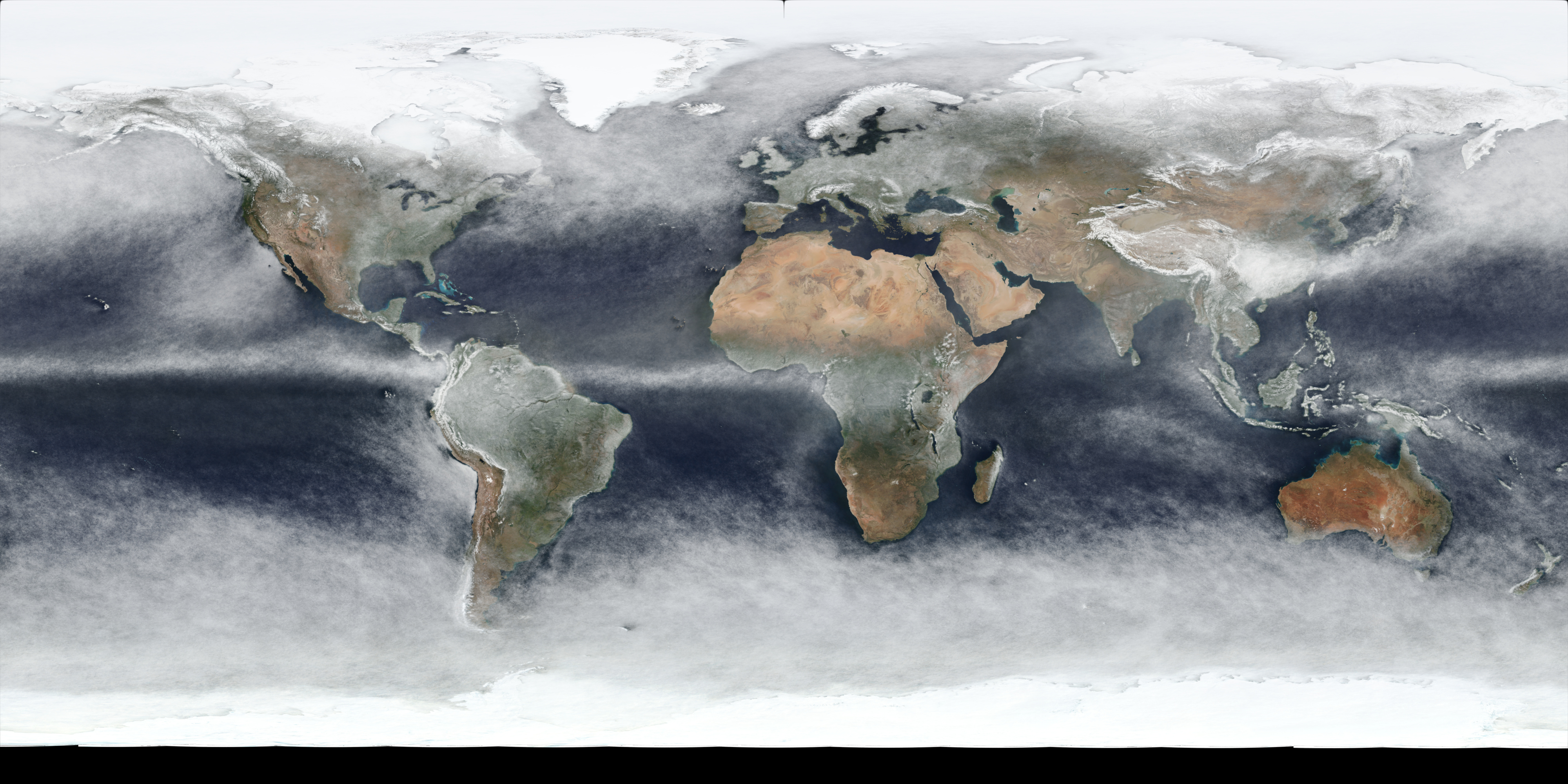
The output result of this for all days in 2021 is this image (full 4k version link):
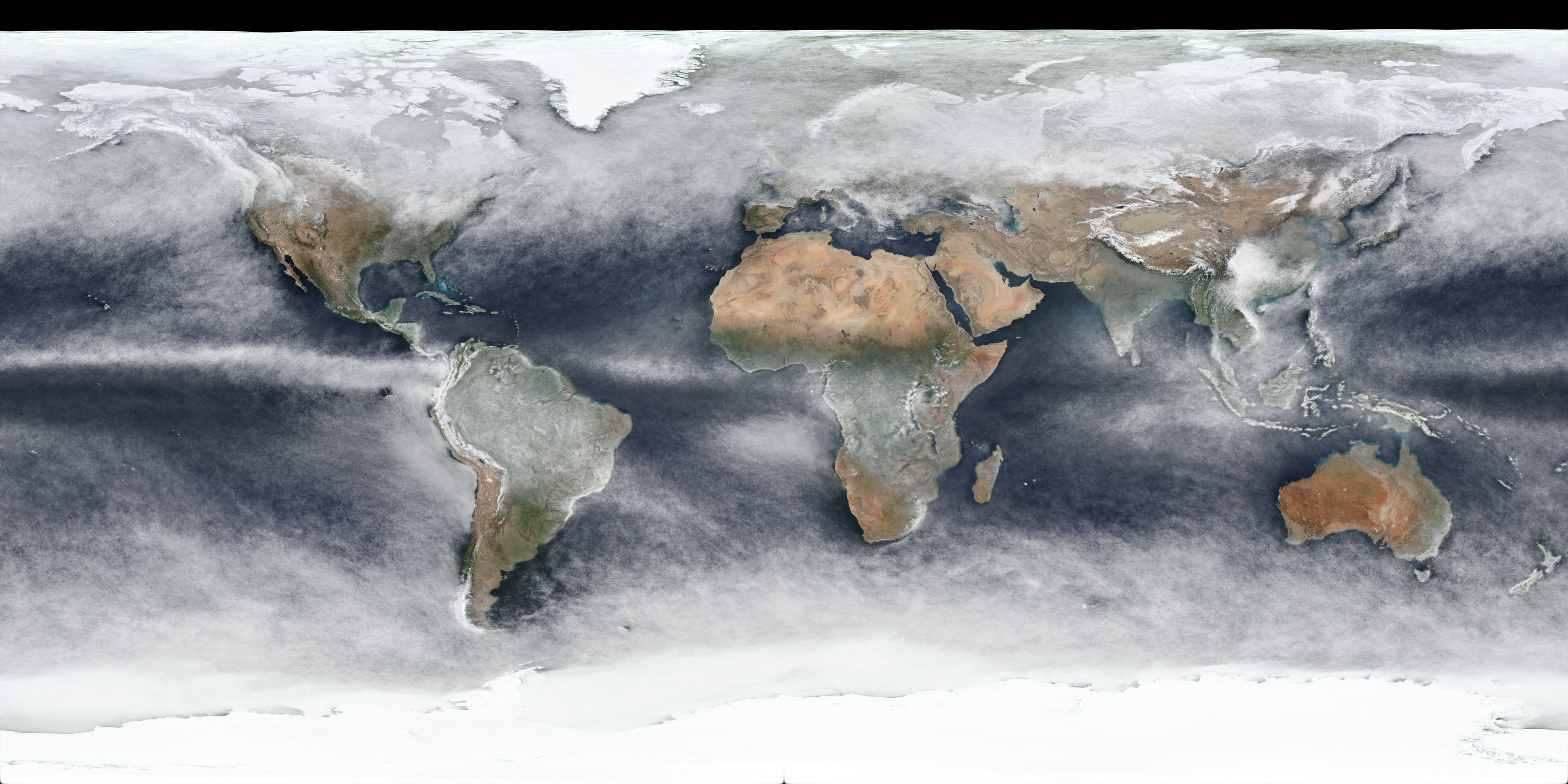
which is using the same WGS 84 projection that the source images used. Reprojected to a more “true-size preserving” projection - Robinson Projection - provides this image (full 4k version link):
Below is a table containing links to 4k versions of per-quarter images for 2021:
The per-quarter versions do clearly show (as expected) obvious differences in seasons, although there may well be yearly variation as well, and snow/ice cover changes will also be included in the changes.
I’m keen to produce more of these in the future - ideally at higher resolution for more localised regions with better projections - in addition to attempting to generate (mostly) cloudless imagery similar to the famous “Blue Marble” images, to see how easy it is to detect clouds vs snow/ice on the ground: either with large vs. small changes day-to-day between images, or I wonder if it’s possible to use Infrared imagery to detect if colours are likely clouds or not, or by using some of the other output info from the VIIRS sensors.
Over the past year I’ve become somewhat interested in visualisations of maps and terrain representations, and in particular “artistic” renders of relief maps. I’ve tried making a couple of different types of renderings of maps in some form or another over the past few years with varying degrees of success, and over the past few months I’ve been progressively creating what I’m terming “Minimalist” relief maps, where a surface is displaced by a Digital Elevation Model terrain height map (often to an exaggerated extent compared to real-word scale) with fairly simple shading, but using light and shadows as a key element to provide a sense of the terrain topology and height in a stylistic way.
These maps are a lot less manual-labour intensive to set up than the previous historical topographic ones I tried which required a lot of manual warping of the DEM images to match up with the historical map, so there’s a lot less effort (on my part anyway) to generate these more minimalistic style ones, and I still find them very nice to look at.
I’ve experimented with various different types of shading, with the main two types I settled on being the diffuse colour mapped to a colour gradient, driven by:
the terrain height value (the Y coordinate height in worldspace)
the occlusion ratio in a hemisphere around the shading point
The latter of which I think I like best (and is what both renders above show) as it allows nice highlighting of the edges and gradients of steeper terrain, although it means the stronger colours are generally in darker more occluded areas which hides it a bit, and the renders are slower as well, as additional raytracing to calculate the surface point occlusion needs to be done during shading.
In a repeat of being inspired to attempt my own version of some nice-looking “artistic” maps that I noticed online last year with population density maps which I attempted to copy (fairly successfully), I recently noticed some historical maps that had been rendered with an exaggerated displaced height to the surface, giving the impression of terrain when combined with lighting and shadowing from a renderer.
So again, I was keen to try and create my own copies of these, and to see how difficult it was.
I discovered the existence of the David Rumsey Map Collection which has a very large collection of digital scans of historical maps of locations around the world, which is very interesting to browse through, and provided a good starting point for the visual “historical” texture for the maps.
Many of them are in very good condition, but some of the more older and more interesting ones are (understandably) somewhat aged in appearance and have tape marks / rips in them to varying degrees. While it would have been possible to do some artistic fix-ups / colour-correction first, it wasn’t something I particularly wanted to get into for my initial attempts (I always like to get to the Rendering part as soon as possible!), so I just picked a few interesting looking historical maps which had minor ageing marks on.
Obtaining terrain heightfield DEM (Digital Elevation Model) data is relatively easy from several sources, and I decided on using GMTED2010 data in the end.
The tricky part was fitting the DEM terrain data to the historical map image, which - depending on the map and its source, likely has an unknown projection, a border around the edge, and as I found out could also have out-of-date or incorrect terrain for some maps which were more than 100 years old. I ended up having to grid-warp the DEM terrain image to fit the historical map which was going to be the visible texture, which is do-able, but a pretty time-consuming manual process in order to do a reasonable job.
With my initial renders using a perspective camera projection from single angles (normally the bottom), I was able to take a few short-cuts with alignment, but for full top-down orthographic camera projections in the future (which will look better), I’ll need to do a better job.
I then rendered them in Imagine, with the historical map image being used as the diffuse surface texture, and the warped DEM image being used as the displacement map.
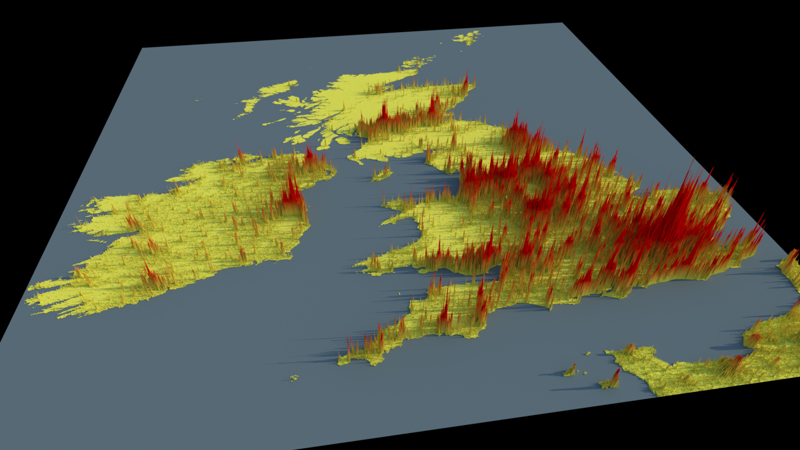
A few weeks ago I noticed on various social media sites some creative and interesting renderings of 3D maps of countries showing their population density as colour-shaded bars extending vertically upwards proportional to the population density values, the original source of which was Alasdair Rae. They’re lit with a fairly low-angled soft light, simulating an early/late sun, which also allows the columns’ shadows to highlight magnitude as well.
I decided I’d try and see what would be required for Imagine to be able to create and render similar looking renders from scratch, using only Imagine and the original source data.
The original data was in GeoTIFF format, which is basically TIFF format but with specific metadata encoding geographic properties like projection and lat/long co-ordinates (which I ignored for the moment), and the data type is normally float32 or float64 (double). Imagine already had support for reading TIFF files in general, but not for reading values as full double-width (float64) floats, so I had to implement support for that.
I then created a Scene Builder plugin (a plugin in Imagine’s UI which can procedurally generate scenes based on input parameters) to generate geometry consisting of small cubes/cuboids based off the data values in the image files, using input image X position for the 3D X axis, input image Y position for the 3D Z axis and the population density values for the Y axis height. Values below a threshold would not generate any geo (i.e. in the ocean with no land).
I also had to merge multiple images together, as each source image represented smaller geographic areas, with boundaries across multiple images for some of the regions I was interested in. For this I wrote custom code as part of the Scene Builder plugin UI to do manual single file / batch merging based off index coordinates.
Functionality to then shade the materials (height falloff gradient, mixed with a 3D grid texture), as well as render the image already existed in Imagine, so I was then easily able to render these:
I ended up ‘cheating’ slightly by not creating full voxel representations of stacks of cubes for per cell columns, instead just using single stretched cuboids to save geometry memory.
One issue with these renders is they’re just using the original source data projection in image space mapped to 3D space, which for places far from the equator like the UK, ends up squashing things quite a bit: I’d need to re-project the data in QGIS to rectify that, which maybe I’ll do in the future, as I do think they look pretty nice.
Some of the source data also seems to have artifacts (extra non-existent land-mass based off rasterising the image input data) in coastal areas, so to render these more nicely, Imagine’s unlikely to be the tool to do these image-space data touch-ups.


